Ever since reading Edward Tufte‘s first book, “The Visual Display of Quantitative Information” — absorbing the contents so completely that I even attempted to teach from it in various venues many years ago — I’ve been susceptible to similar books and treatises. Tufte’s subsequent books, as lovely as they are, have all been derivative and disappointing. Recently, I came across “Picturing the Uncertain World: How to Understand, Communicate, and Control Uncertainty through Graphical Display,” by Howard Wainer. It’s emphasis is on statistical analysis and clear thinking as much as graphical display, but it’s a different book entirely. Wainer tackles some current controversies and problems, all in an entertaining and coherent style.
It’s not a flawless book for the general reader. There are dense sections (or sections that made me feel dense), and a number of essays seem to close with a snap instead of a tidy cinch of ideas. It seems as if bigger ideas were brewing, and either an editor carved out more fulsome sections or Wainer simply started big and finished brusquely. It’s hard to know the cause, but the effect is sometimes jarring.
That caveat aside, the book is worth the read. There are sections many in this audience will find appealing, including many items touching on standardized testing (especially the SAT), scientific journal display, and statistical thinking.
What I always love about good statisticians is how they return to very basic concepts in order to make sure they’re framing a problem correctly. I’m not sure I always agree with Wainer’s frameworks, but at least he acknowledges and reveals his framing. So many people neglect this step, or obscure it. It’s nice to see a book written by a person so attuned to the perils of framing ideas.
Wainer isn’t shy of controversy. In fact, he seems to relish it, probably because if there are quantitative aspects to it, he’s well-armed to deal with it. Topics covered include how data presentation around educational attainment vs. dollars spent has misled us all; how graphical simplicity can make even the Medicare drug plan sensible; how George Schultz spun a political discussion by creating a narrative-friendly axis on a chart; and how New York’s debate about all-or-none primary election delegates got it backwards.
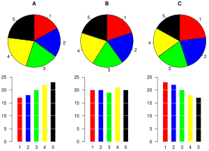
Some of the most compelling examples for me came when Wainer simply redrew pie charts as line charts. By eliminating the well-known frailty of area comparisons and reducing them to direct linear comparisons, new insights emerged.
The New York Times’ graphic and data artists are cited for making great strides over the past 20 years, and this is well-deserved. Their charts — both interactive and static — are models of clarity and information.
“Picturing the Uncertain World” is not a perfect book, but it’s a very good book, and consistently interesting, especially if you have a penchant for statistical analyses, a stomach for controversy, and a desire to challenge your mind and your thinking. If, ultimately, you’re also attuned to the virtues of graphical displays based on data, then it’s probably a book you should definitely read.
I say that with 95% confidence.
Discussion
4 Thoughts on "Graphical Displays, Statistics, and Thinking Straight — "Picturing the Uncertain World""
Love your last sentence 😉
At the other extreme I recommend “How to Lie with Statistics” by Darrell Huff, which is very simple and has a lot on graphical display as well. Originally written in 1954, it was reissued in 1993 and is still in print, and cheap ($6.24 for Kindle). Because lying with statistics never goes out of style, right?
I always preferred “Visual Explanations” as my favorite of Tufte’s books. I thought it did a better job presenting a problem then showing ways to fix it than did his earlier books. Still, any Tufte is worth a read.


