There is always something going on in biomedical publishing. If it isn’t a new journal, a new funding policy, or a new publishing service intent on revolutionizing the way scholarly publishing is practiced, there’s always plain old competition shifting the relationships and the pecking order of journals.
These changes–taken individually or collectively–often take years to manifest themselves. With hundreds of thousands of biomedical papers being published each year in thousands of journals produced by hundreds of publishers, it’s hard to get a clear picture of what is going on. It is much easier to see patterns and changes in biomedical publishing when multiple pictures are put together and run as a movie, which is what this post is about.
Thanks to the assistance of Marie McVeigh, Director of Content Selection at Thomson Reuters’ Journal Citation Report (the annual report that issues the Journal Impact Factor, along with other related metrics), I was able to create such a movie. This is a movie without a single narrative, although I will recount a few stories from the data that describe major changes taking place. Other narratives are up to you to discover, and I encourage you to describe other interesting trends you see in the comments section below.
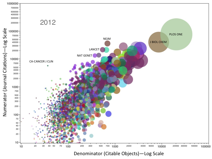
The type of figure I created is called a bubble plot, in which each data point is assigned a size based on a variable of interest; in our case, the size of the journal, as measured by the number of articles it publishes. The Y-axis (vertical axis) in these plots are the number of citations the journal receives that count toward its Journal Impact Factor (JIF). This number forms the numerator of the JIF. The X-axis (horizontal axis) is the number of citable objects published by the journal that count toward the JIF. This number forms the denominator. The position of the journal in the bubble plot is therefore a visual representation of its Journal Impact Factor for any given year. We have 10 years in this representation and when you flip through them sequentially, like a flip book, you animate the plot.
For any given year (2003-2012), there are three to four thousand journals. Some are added to the dataset after 2003 and some drop out along the way. Over time, the number of biomedical journals indexed by the Journal Citation Report has been growing.
Lastly, I’ve assigned a color to each publisher in the study. Many of the publishers have just a few titles in the dataset, but there are some large commercial publishers (Elsevier, Springer, Wiley, LWW, SAGE, OUP, among others) that account for many hundreds of titles in the dataset. Here, the Journal Citation Report dataset was less consistent, containing many variants of the same publisher name as well as old acquisitions that remain as imprints. I’ve tried to catch the big ones, but if you see some major oversights, please contact me directly and I’ll update the file.
To animate the bubble plot and play with its features, you’ll need to have the Adobe Shockwave browser plugin or some other way to view the data. If this is a problem for you, for whatever reason, I’ve provided some static pictures of the data. Please don’t ask me for technical support.
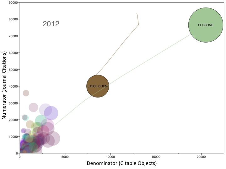
The first figure is a snapshot of 2012. You’ll notice that most of the journals are located in the bottom, left-hand corner, publishing fewer than five-thousand articles and receiving fewer than thirty-thousand journal citations. The vast majority of the dataset is obscured in this cluttered corner. In the other corner is PLOS ONE, a journal that received over seventy-six-thousand citations to over twenty-thousand citable articles. The Journal of Biological Chemistry is the next largest journal in the graph. I’ve added two tracers so you can see how these two journals have changed over the years.
Shifting the axes to a logarithmic scale reveals most of the dataset, and it is here that you’ll find other notable patterns and trends. First, while PLOS ONE and the Journal of Biological Chemistry are still extremely large journals, they don’t appear to perform as outliers, just extensions of a general trend. Some of the major biomedical journals sit on top of the curve, The NEJM, The Lancet, Nature Genetics, among others, receiving far more citations than their size would predict. CA-A Cancer Journal for Clinicians is a particularly small journal that boasts an enormous Journal Impact Factor (153.459 in 2012). The cluster of purple journals at the top are all Nature specialist and review journals. If you select just the Nature journals in the animation, you can see how new Nature titles perform over time. You’ll also see the effect of several name changes (Nature Clinical Practice journals were rebranded as Nature Reviews journals in 2009).
Enough of my own description. Download the file and make sure to play with the settings for the visualization from the controls at the bottom of the animation as well as from the pull-down menu (top-left corner). You may also be interested in viewing a bubble plot that shows the percentage of article citations that contribute to the calculation of a journal’s Impact Factor over time. For some of the journals, close to 100% of all citations point to articles published within the Impact Factor window. Coincidence? Turn the speed of the animation to the lowest setting and the bubble size to its highest setting and you’ll see a curious pattern for some journals.
If you are now excited about bubble plots, you can see another visualization of the growth in article output from China, as well the relationship between publication output and economic well-being in Africa.

Discussion
8 Thoughts on "Dynamic Visualization of Biomedical Journals 2003-2012"
A few small remarks.
First in your static pictures, there is a variable, size of the journal, that is visualized twice (by dot size ad by x-position), is there a reason for this?
Second, in the log-log graph, constant levels of the impact factor function are the lines of slope 1, so the most upper left a journal is, the largest is its IF. Maybe a few of these lines should be drawn. Unsurprisingly, many of the movements in the animated plot seem to be along the diagonal, indicating a shift in size with constant IF.
A few dots seem to move perpendicularly to the diagonal, indicating a shift in IF which is “optimal” in this scale (it is the shortest way in this coordinates to increase IF by a given amount; this is obtained by increasing citations received in the same proportion than the number of published article decreases). Are there many such moves? It is explained by a policy to raise the selectivity of the concerned journals?
Regarding the first point if the size is the total number of article like objects then it can be very different from the number of citable objects. Science magazine for example has many news items and commentaries. It also has a lot of job ads so I wonder how size is measured in this case?
cf. fig 5 in the 2005 JASIST paper:
http://onlinelibrary.wiley.com/doi/10.1002/asi.20090/full
As I look at PLOS ONE and the sheer number of articles it has published (over 31,000) since its founding in 2006, and its impact factor, I am reminded that even a blind squirrel finds a nut in the forest every once in a while.
Their IF is below the diagonal so relatively low.
Lovely visualizations. But: “Coincidence? Turn the speed of the animation to the lowest setting and the bubble size to its highest setting and you’ll see a curious pattern for some journals.” I don’t get it, what is the curious pattern am I missing?
Interesting graph. It might have been helpful to include lines for a few values of IF. A 45-degree line would be an IF on 1.0.
It seems to me (drawing the lines in my mind) the highest IFs are achieved by smaller journals. The big ones seem to gravitate towards the mean?
More clarity might be achieved by taking form and circulation into account. Surveys were done of physics journals some time ago — focusing on only on price, finding a huge range, and creating considerable confusion (never admitted). Separating translation journals and eliminating bulletins helped, but only a little.
I would try segregating magazines (NEJM) in English and with circulation sufficient to attract advertisers, research journals, review journals, journals not in English, etc.