The scientific community needs to put less emphasis on Journal Impact Factors (JIFs), argued a bibliometrician and a group of distinguished science editors and publishers, and start embracing citation distributions. Their paper, posted to the bioRxiv, provides detailed steps on downloading article-level citations and plotting frequency histograms.
In my last post, I argued that this solution does not address their litany of criticisms of the JIF and may serve to confuse more than clarify. In this post, I describe how one can manipulate a histogram to selectively highlight or obscure the underlying data.
histograms are not mathematical formulae but data visualization tools. Without strict definitions on what elements get reported and how axes are defined, histograms can be manipulated to emphasize what you want to promote or obscure what you want to hide.
Unlike calculating a mean or median, both of which are mathematically defined, a histogram is a technique for visualizing data. There are no rules about how to bin one’s data or scale one’s axes. These decisions are left entirely to the author and their appropriateness is largely a matter of context.
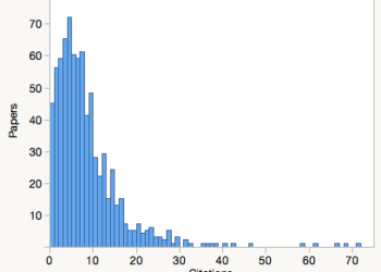
Consider the following three histograms. While they look very different, they are created from the very same underlying dataset—the performance of articles and reviews published in Nature in 2013 and 2014, as measured in 2015.
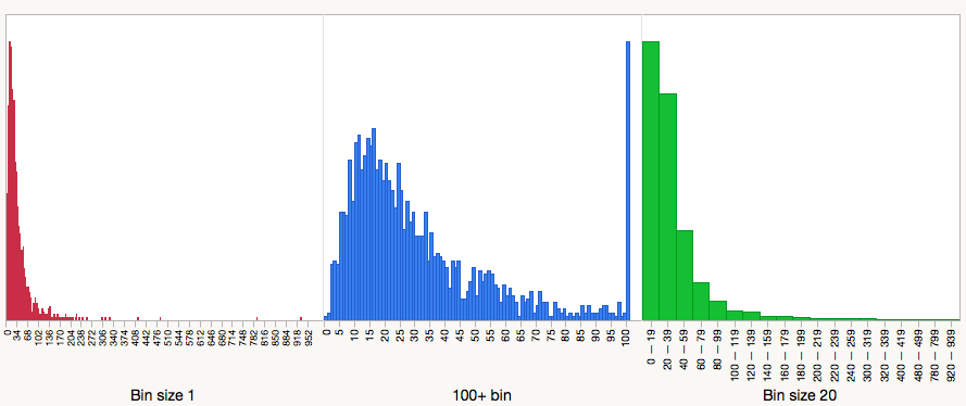
In the first panel (red), I plot a simple frequency histogram of Nature papers. The vast majority of the data are jammed into the head of the distribution and most of the plot is used to detail highly-cited papers. This histogram emphasizes the long tail of the distribution.
In the second panel (blue), I dump every paper that received 100 or more citations into a single bin—this is the tallest spike at the right of the distribution. My decision to use 100 as the cut-off was entirely arbitrary. It could have chosen 50 or 75 or 250. Had I been working with lower impact journals, I might have chosen 10 or 5. I chose this cut-off because it was used in the Larivière paper. Whatever the reason, this distribution looks very different than the first panel. It emphasizes the head of the distribution and it is in this panel we reveal the performances of papers that received few citations or none at all. This point was largely obscured in the first histogram.
In the third panel (green), I decided to bin my data, a routine practice when reporting frequency data, especially when a researcher is unable to count a true value (e.g. how may journal articles did you read this month?: 0, 1-5, 6-10, 11-20, 21+). You’ll note that my decision to bin the data this way obscured the fact that there were uncited papers, as they were grouped with all papers receiving fewer than 20 citations.
Beyond manipulating the presentation of the citation histogram, I could also selectively decide what I report. For example, I could include just the performances of original research papers and reviews but exclude perspectives and commentary. After all, why should Thomson Reuters define what I report?
Whatever decisions went into creating one’s citation distribution, it can’t be overemphasized that histograms are not mathematical formulae but data visualization tools. Without strict definitions on what elements get reported and how axes are defined, histograms can be manipulated to emphasize what you want to promote or obscure what you want to hide.
While Larivière and others call on editors and publishers to create their own citation histograms — a time-consuming process that is restricted to those with subscription access to a commercial citation service — a more acceptable solution to avoid selective and non-standard reporting across tens of thousands of journals would be to ask the citation services (Thomson Reuters’ Journal Citation Report and Elsevier’s Scopus) to plot them for users. These services would create a standardized citation histogram and include within the figure a stamp of authenticity. To ensure that these histograms are not counterfeit, they would link directly back to the issuing service.
Without the citation indexes stepping up to provide standardization in distribution reporting, it is unlikely that Larivière’s call to action will result in widespread adoption. At worse, it will encourage the production of histograms that selectively highlight certain features while obscuring others.

Discussion
24 Thoughts on "How to Manipulate a Citation Histogram"
Any visualization of primary data can be subjected to favourable or even distorting presentation.
As discussed in Larivière et al. and in the comments to your last related post on this blog, the point of showing distributions is not a better visualization of journal performance, but rather – and very simply – to point to the skewed, long tailed distribution of citations to papers in all journals, which render JIFs meaningless in the evaluation of individual research output.
ISI is more than welcome to report the distributions of course.
And to use medians and drop three decimal places too.
On a related note: the same argument you make leads many publishers to religiously quote JIF to the 3 decimal places favoured by ISI to ensure that journals rank nicely. Why not quote 1 decimal places, but always round down to ensure one cannot be accused of elevating one’s score? Another overdue standard waiting in the wings.
If the point is simply to remind readers/authors that Impact Factors are made up via a wide distribution of citations to different papers, then why not just make that statement in every journal, rather than going to the trouble of preparing and displaying the histogram? If you are only trying to make a singular point, why not clearly and consistently state it rather than asking for a complex visualization that is going to vary for every single journal and lead to many different interpretations other than the one you’re seeking?
because data is more compelling than words – that is why we have figures to support claims in research papers.
At EMBO Press we actually strongly encourage publication of the source data alongside figures precisely to allow re-analysis and to buffer any ‘presentation drift’ in data visualiziation to supports textural claims.
Showing the histogram does not provide the “source data”, and you would need to make available the citation record for each article in the journal along with a detailed explanation of the methodology used to generate the histogram, if you do indeed wish to encourage re-analysis and buffer presentation drift. Will EMBO be providing this additional data in each of its journals?
My point, however, was that if you’re only trying to make one thing clear–the number of citations that each paper in a journal receives is variable–is this the clearest and most effective way to make that point? As you suggest in your initial comment above, the actual data here does not matter, you don’t care about effectively showing “a better visualization of journal performance”, you only want it clear that there’s a spread. So if the actual data is as meaningless as you suggest, why go to the effort of showing it? I look at the three histograms in this blog post and see very different things, rather than the one consistent message you seek to get across. Why not just clearly state that message?
Because the data do matter (Bernd never denied this, despite the assertion in your comment). As he said “data is more compelling than words”. Our proposal is simply in line with the expectation of journals that researchers make available the data on which they base the conclusions stated in their papers. I think making these distributions widely available will help researchers to think a bit more carefully about what metrics mean. I also think most (all?) of them are smart enough to spot if journals are trying to distort their messages by excessive binning, and of course, best practice would be to make the data available too.
I’m getting something of a mixed message here. Is the point then a careful examination of the journal’s citation record as a means for a researcher to make an informed choice as to where to publish their paper or is it to make the simple point that there is variability in the number of citations a given paper receives? If I’m an author and I go look at a histogram in a journal, what exactly am I supposed to take from it? When I’m choosing where to submit my paper and I look at histograms from several journals, what specific factors should influence where I end up sending my paper? Or is it just there to remind me of the most basic concepts about how the Impact Factor is calculated?
And personally, I feel that if someone is smart enough to spot if journals are trying to distort their message by excessive binning, then they are likely already aware of the basic point that Bernd is trying to convey, which is obvious to anyone with the slightest understanding of how the Impact Factor works.
David, this comment makes me wonder if you have actually read our preprint. Have you? Nowhere do we suggest that the distributions should be used as a tool to guide the decisions of authors in choosing where to publish.
I have read the paper, and that’s why I’m confused by the continued mixed messaging surrounding it. I ask again, what is the practical value of the data presented in each individual histogram? As an author, if I go look at EMBO’s histogram, then PNAS’ histogram, what am I to do with the individual data points? Is there any practical use I can make of them, or am I just supposed to look at each and be reminded that papers in a journal receive a variable amount of citations? If PNAS has X papers with 10 citations and EMBO has Y papers with 10 citations, what does that mean to me as an author/reader?
If being reminded of the spread is the sole message being presented, then the individual data points are meaningless. And to me, calculating and displaying complex and variable histograms in order to throw out the data and make a simple point seems an overly complex and unclear way of presenting a straightforward message.
sorry to have confused more than clarified re. three levels of information sharing: text>figure>source data.
scientific journals publish data rendered in all manner of non-standardized ways (including histograms) and it has not stopped scientific progress. However, posting source data alongside scientific findings in research papers definitely adds transparency and value (e.g. The EMBO Journal (2014) 33, 2597). For citation distributions, we were not sure this was a must have: People with access to ISI or Scopus can easily replot.
I suppose it’s admirable to hold one’s “About the Journal” page to the same standards as one’s articles, though if so, perhaps there should be more data shown for every aspect of the page (why no data backing up the claims on peer review?).
Regardless, I’m a bit disappointed that no one has ventured an attempt to answer the basic questions that have been raised:
1) Can anyone provide a clear and succinct argument as to why the use of histograms will decrease dependence and inappropriate use of the JIF?
2) If the whole point is merely to remind readers/authors that there is a variety of citation numbers received by each paper in a given journal, does the actual data matter? If that is the point (“the point of showing distributions is not a better visualization of journal performance, but rather – and very simply – to point to the skewed, long tailed distribution of citations to papers in all journals”), then why bother with all the detail that serves no purpose, obscures the actual point being made, takes time and effort and costs to prepare? Is there really a huge population of researchers out there so dumb that they think every single article in a journal receives the exact same number of citations? If so, where is the data that shows this is a common belief?
David you are missing the point and making things too complex. It is done, because it can be done! I remember programing in basic to do a simple spread sheet; then along came visicalc and all of a sudden spread sheets were 50 feet long and had hundreds of columns. Why, because it could be done! In short, it is what people who like to play with computers do. I am sure you have sat at your desk and some colleague walked in and said look at this I just did it on my computer. You said what is it and s/he said it represents X and you said oh.
Thanks again for your interest in our work Phil. If I may be so bold, I think you have once again missed the main point of our preprint and got a bit sidetracked.
To respond constructively to particular points:
We have not been prescriptive about the particular format of the histograms because we did not feel it was our place to lay down the law for everyone else. We wanted to stimulate a conversation and are pleased to see that we have been very successful at that. At time of writing, our preprint (http://biorxiv.org/content/early/2016/07/05/062109) has been downloaded over 9500 times and therefore, we hope(!), widely read. We were pleased to see, for example, this interesting piece last week by the newly installed editor of Science (http://science.sciencemag.org/content/353/6299/523.full).
The primary point is about transparency. As a first step, we would recommend that journals follow our format (which corresponds to your middle plot above). There is nothing to stop them using other formats although it would help if they stated the reasons for doing so and made their data available (as we have done) so that others, like yourself, might easily experiment and contribute to the discussion. With good will, a common standard might emerge from the wider community.
No method for characterising the citation patterns of papers or journals is free from manipulation –including the JIF, as discussed in some detail in this editorial by Ben Martin – http://www.sciencedirect.com/science/article/pii/S0048733315001390). That’s a point that could usefully have been made in your post.
The point is not to replace the JIF but to complement it with the citation distributions so that the underlying data are more transparent. And the primary aim of our proposal is to direct attention away from the journal metric so as to focus the attention of assessors on the individual paper.
Our method is not especially onerous or time consuming. Indeed we have tried to make it as easy as possible by making step-by-step recipes available, fully illustrated by screenshots. If anyone has tried them and found problems, we would be glad to have the feedback and could update.
It’s true that the method is currently restricted to those with subscriptions to WoS or Scopus, but this will include many publishers and journal editors, the user groups that we would most like to see adopting the practice of publishing distributions. Moreover, you omitted to mention that one of our key recommendation is for journal publishers to make their reference lists publicly available through CrossRef – this would solve the limited access problem and increase the transparency of the data.
In theory, asking WoS or Scopus to produce standard citation distributions has a certain convenience value, but it does not address the point about data transparency. The difficulty that those outside TR have had in reproducing JIFs is well documented (e.g. https://quantixed.wordpress.com/2016/01/05/the-great-curve-ii-citation-distributions-and-reverse-engineering-the-jif/) so it is hard to see how any “stamp of authenticity” could be issued while the citation data are held behind paywalls. We would welcome any moves by the publishers to make these data open – and any discussions on ideas about a workable standard.
For any publishers who are interested in distributing their reference lists through Crossref, it is very easy to do. We recently posted an entry summarising the process:
http://blog.crossref.org/2016/06/distributing-references-via-crossref.html
Stephen, I’ve read your paper several times, so you can stop beginning every response with a rhetorical slap that I’ve clearly misunderstood the point of your paper. If your abstract can be the clearest enunciation of your main argument, it is that increased transparency, via. the citation histogram, will reduce inappropriate use of the JIF. In my first post, I argued that this logic doesn’t necessarily follow, that histograms will likely increase confusion, and that you’d be better off promoting a better indicator. In this post, I’ve demonstrated that there is no formulae for creating a histogram, as opposed to an average citation rate, and that histograms can be manipulated to highlight (or obscure) the underlying data.
Your counterarguments all make hand-waves toward transparency—as if transparency is a universal salve for all problems in science—and point to all of the attention you’ve received. You still haven’t provided a clear and succinct argument as for why citation histograms will decrease dependence and inappropriate use of the JIF. Can you please address this central argument?
I’m clearly not making much headway here. I stand by my comments and by the paper (which contains the central argument behind the proposal). I invite readers to judge these for themselves. Best wishes all.
It sounds like you’ve “clearly” given up.
I think a central problem with this approach, in addition to those outlined by Phil here and me earlier (https://scholarlykitchen.sspnet.org/2016/07/21/optical-illusions-shifting-to-citation-distributions-only-makes-it-easier-to-fool-the-eye/) is that this attempts to bridge the JIF into something that appears to apply to papers. And that’s where it breaks down, because clearly it doesn’t — that is, there is no predictive value to the data points in the histogram. So, it’s useless, except rhetorically, to illustrate a spread, which is interesting for about a microsecond before you realize that like every other average, there is a skew, a tail, and so forth. And most skews are going to be toward zero for most journals.
The flaw is that these data are boring and uninformative. Dressing them up as pretty pictures doesn’t change this. Data transparency around boring, unhelpful data only underscores that these are boring, unhelpful data.
Though not the exact definition, I would consider these visualizations unnecessarily complex and fiddly, and thus, Chartjunk:
http://www.edwardtufte.com/bboard/q-and-a-fetch-msg?msg_id=00040Z
A frequency diagram (e.g., percentage of papers that receive X or more citations) shows much more and avoids the inherent biases in binning the data for a histogram.
I can’t agree. Cumulative distributions give a quite spurious impression of precision (because of the serial correlation between bins).
Any scientist has no difficulty in assessing a histogram/ I can’t understand at all the objection to Curry’s. Idea is a step towards debunking the impact factor, albeit a small step.
Any scientist has no difficulty in assessing a histogram/ I can’t understand at all the objection to Curry’s. Idea is a step towards debunking the impact factor, albeit a small step.
My objection is that it is an overly fussy and complicated way of making a relatively simple and well-understood point. Others object because it further cements the use of the IF as the standard metric for journal assessment, rather than trying to drive usage toward more appropriate metrics.
If funding agencies such as in Britain and Australia based their distribution of grants based on their evaluation of the research rather than on the quantity of publications and the JIF and the same held for T&P where would academics publish and with what frequency? One ancient example from the medical area was from a group that wanted quick exposure using an OA journal but held back for the standard, high impact journal because one of their team was up for promotion.
It was mentioned, in the Kitchen that survey numbers show that academics are well satisfied with the current system. I wonder if one would dig beneath the figures….
Are the “arguments” here more to rank one journal over another? Is it to rank the coup in quality and quantity that an article can accrue by journal choice like meat in a butcher shop?