- Microsoft Surface (Photo credit: Pikcel Project)
It’s been five and a half short years since Apple launched the original iPhone, just over four years since the first Android phone hit the stores,and we are coming up fast on the third birthday of the iPad.
These devices have been transformative and disruptive, unleashing a whole new way of interaction; not just touch, but a plethora of sensors as well, that observe us and the environment we are operating in, and adjust things according to what we are doing. Today, I can turn casually to my iDevice, ask it what the weather will be this weekend, and it will tell me, taking into account my location on that date if I want.
Computer, make it so.
A tightly coupled combination of hardware, software, and design has brought us to a world of ambient computation where the form-follows-function philosophy has reached new levels of subtlety and sophistication. As publishers, we have had to respond to this; responsive design vs reactive design; Apps vs Websites; which mobile OS to support and which to ignore; how to deal with users who move across multiple devices during the course of their daily workflow; what information for which context; how to make money on any of this; all the good things of an IT business strategy that now needs to be reevaluated on a continual basis.
Missing from this picture is one of the great titans of the software world: Microsoft. Just six months before the iPad arrived on a mission to redefine what one might need or want in a computation device, Microsoft launched Windows 7. It’s excellent. But three years is a long life-cycle when you are looking at the inexorable rise of the touch-based, sensor-augmented, cloud-backed tablet.
Clearly, their next operating system would have to deal with this.
The announcements started in 2011, and it was immediately obvious that things were going to change; the familiar desktop interface seemingly being replaced with a Mondrian like user interface, all squares and blocks of colour. There was talk of making the OS work for low-power chips that one finds in a tablet as well as the electron-snorting mega-core beasts from Intel and AMD. And then Microsoft announced something major — this time it wouldn’t just be software, but hardware too. The Microsoft Surface, a duo of touch devices running the latest operating system, would show off their vision of a touch-driven, Windows-powered world.
This is my review of the Surface RT — the version built for “low-powered” chips, running a version of the operating system especially built for the capabilities of the hardware. Now before I dig in, a bit about me. I’m actually mostly a “Windows Guy.” I really like Windows 7. I do use an iPad (a lot actually — maybe not so much a Windows Guy then) and I have a (rubbish) Android phone. Hopefully the above sets what follows in context — I don’t think I have a particular axe to grind here. Also, this isn’t a review about the chips or the camera specs or any of that. It’s about what it’s like to use, and what I think it means for Microsoft, and of course, us. It’s also a personal view. I’ll split it into two sections: a look at the hardware, and then the user interface.
The Hardware. So the first thing you will notice about the Surface is the aspect ratio. It’s a 16:9 rectangle. This immediately sets it apart from things like the iPad. It’s made of metal and glass, no cheap plastic here. The sides of the Surface are angled back (with some fairly sharp edges), and there’s an integrated stand which makes for a very stable device in landscape mode. There are two cameras, a micro HDMI port, a USB port (yes it’ll take a usb drive just fine), and a microSD card slot as well (you can store files, but not Apps, it seems). Thus, the complaints against the Apple and Google devices have been taken on board. No expensive clumsy dongles needed here, thank you very much. This is a “proper device.” The keyboard and power supply attach using magnets. Either of the two keyboards you can buy will form a screen cover for the Surface. Weight-wise, things are pretty even with the iPad — the Surface comes in at 688g whilst my iPad weighs 651g.
The thing is, in an anecdotal study (I canvassed the opinions of assorted colleagues), everybody seemed to think that the Surface was much heavier than the iPad. In fact, it seemed to be uncomfortably heavy.
I think I know why — it’s the aspect ratio of the thing.
An iPad is designed to a 4:3 aspect ratio. It’s a more squat design. When you pick up an iPad, you instinctively hold it in portrait mode, your hands on either side of the longer sides of the device. In fact, a natural grip for the iPad (and all similar shaped tablets) means that roughly half the device sits in your hands, leaving the other half cantilevered out away from you. Crucially however, it’s naturally well-balanced. But for the Surface, this isn’t true. Only about a third of the device sits within your grip; the rest extends out (two-thirds of the weight, 458g or 1lb in old money). It gets tiring quite quickly. This isn’t helped by the sharp angled sides, either. Portrait use isn’t good for the Surface, which is unfortunate as potentially a longer screen gives more real estate for reading. I say potentially because a number of my colleagues found looking at websites tiring because the upper end of the screen in portrait mode was far enough away from them to trigger refocusing as their eyes moved around the screen. I didn’t notice this myself, but it’s something to bear in mind.
Back to the keyboard. You can get two kinds. The “Touch Cover” costs an eye watering £100; the “Type Cover,” which has actual clicky keys, seems almost a bargain at £109. Almost. Here’s what I can say about the Touch Cover. If you are a certain age and from the UK, you may recall the legendary ZX81 home computer. It had a touch keyboard that really didn’t work well at all. Well, the Touch Cover isn’t quite that bad, but it certainly isn’t a match for even the cheapest wireless Bluetooth keyboard. I also have some misgivings about the longevity of hinge area given that it’s fabric with a bunch of magnets bonded to a piece of metal. Without giving the game away on the software and the UI, you do need to know this — a keyboard isn’t really an optional item for the Surface.
And then there’s the kickstand. In theory, this is a brilliant idea as it’s built into the device and it’s made of metal so it’s nice and solid. And to start with, I was of that opinion. However, with use, the thing just doesn’t tilt back far enough for me to get a decent view of the screen. With a conventional laptop, you just adjust until you are happy. You can’t do that here. You’ve got one angle, and that’s it. Also, it’s clearly designed to tilt the tablet so it can be used with a keyboard. There isn’t any smart cover angle variation available to you here. You want to use the on-screen keyboard, you’ll be pecking away with the thing sitting flat on whatever surface you are using it. It’s a bit unfortunate really — a clever idea that doesn’t quite deliver as flexibly as some of the competition.
So just looking at the hardware, its a well-built device with some rough edges that’s seemingly a bit happier in landscape mode. For all its tablet-like characteristics, it’s not great when used that way for any length of time. In sticking with the modern PC-centric 16:9 ratio for a screen, something has been given up in terms of usability as a tablet. Using the Surface has brought home to me just how subtle a science interface design can be. With the iPad, it starts with the physical ergonomics, and they do just work. With the Surface, things don’t work nearly as well. Still, the physical design can be refined. What about the software?
The Software. If I’m honest, it didn’t start well. My tablet experience involves pressing a button, and my device just turning on instantly. Updates get done when I want them to happen. Powering up the Surface for my first look at it (not, I hasten to add, the first time the machine was powered up), it took what seemed an age and then promptly went and installed a bunch of updates whilst I waited. Very Microsoft. Still, I got to the home screen eventually, and it hasn’t messed me about since. Good news, you can set up user accounts. Kudos to Microsoft for this, as it’s missing on iOS and Android, and I for one wish for that functionality.
Anyway, You turn it on and shortly after you get to the Modern UI interface. It looks like this.
 You have three and a bit columns, each wide enough for a large coloured block, or two smaller blocks. Each of these blocks represents an App, and some of them can be set to be dynamic, such as the mini-slideshow effect you can get for the photo App. It seems arbitrary whether an App is a double-wide block or not. You can change the size, but you can’t change the colours of the blocks other than picking one of the fairly horrible colour schemes. The columns fill from top left, down and then across. What this means is that you have no real choice over the number of apps in a row, or a column. You can’t make a screen with say your top five Apps and then shift everything to another screen. Here, you can add between two and four more Apps and then you’ll be adding into the next screen. Now, despite this, there is another page of Apps. Because of this and the rules about row and column filling, you’ll find that as you start to organise things the way you want them, the system will start to shuffle other blocks around in order to keep things the way it thinks they should be. That can get annoying rather rapidly. In fact, I think the whole idea is a bit of an acquired taste. Personally I couldn’t find a colour scheme that I liked, and I found the colours visually jarring. The text in the blocks is small, and if the icons don’t immediately trigger recollection, you can end up swiping around looking for things. The dynamic blocks then get really confusing; is it a travel App, the picture gallery or Bing search?
The Rough Edges.  You don’t have to look to hard for them. This is a common site — a load screen that you sit at, wondering what’s going on before getting to the thing you wanted. This one is for the Store, and when it finally loads, you will realise that it hasn’t been thought through very well. Now to be fair, I don’t think any of the tablet players have got a good store UI sorted out yet (and that’s really not good enough). But this one, well, it’s a bit special.
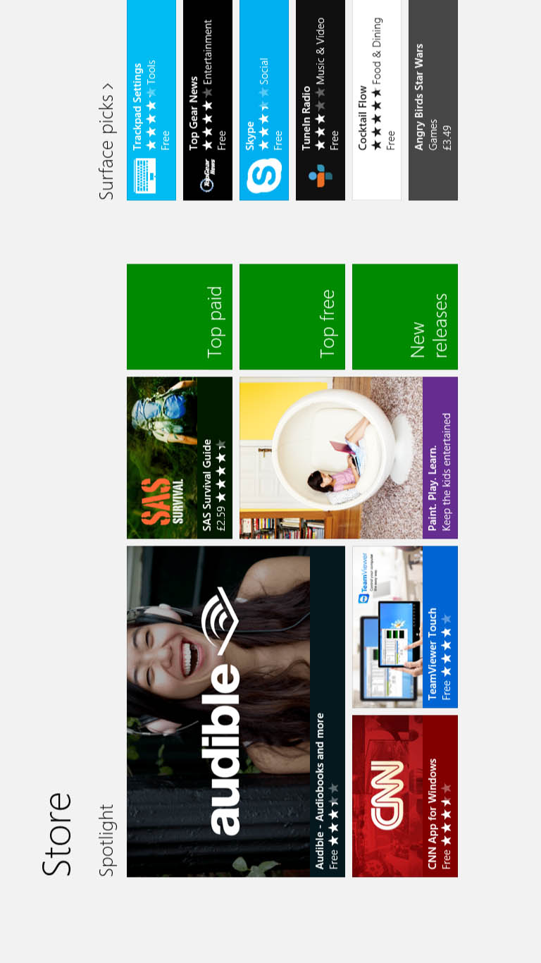 Here for example is how it looks in portrait mode. Yes, according to Microsoft, Apps are found and installed only from landscape mode. It gets better. In the image to the left, you can see the spotlight section. It’s the first of 22 sections.
There’s no method to jump straight to a section. You have to swipe, and to get to Books and Reference (section 9), Productivity (section 17), Tools (section 18), Education (21), or Government (22), you’ll be doing a lot of swiping.
The pictures you can see are adverts for Apps. To actually get to a list of Apps, you’ll tap one of the green blocks (for top free, top paid, or newest Apps), or hit the text for the section. The section text is the only App browser with any filters built into it to allow you to get a better view of what is on offer. As an example, you’ll be pleased to know that in the Books and Reference section there are five categories: E-Reader, Fiction, Kids, Non-Fiction and Reference; but there are no subcategories in Education, Business Productivity . . . just filters for price and rating.
The search function is actually part of the general Modern UI interface. You swipe in from the right to bring up something called a Charms Bar, and the search box you see is contextualised for the Store. Sort of. You see it doesn’t matter a jot whether you have swiped and selected a section or not. You are searching the whole thing.
And then I managed to do something, and Microsoft promptly showed me what we are really dealing with here.
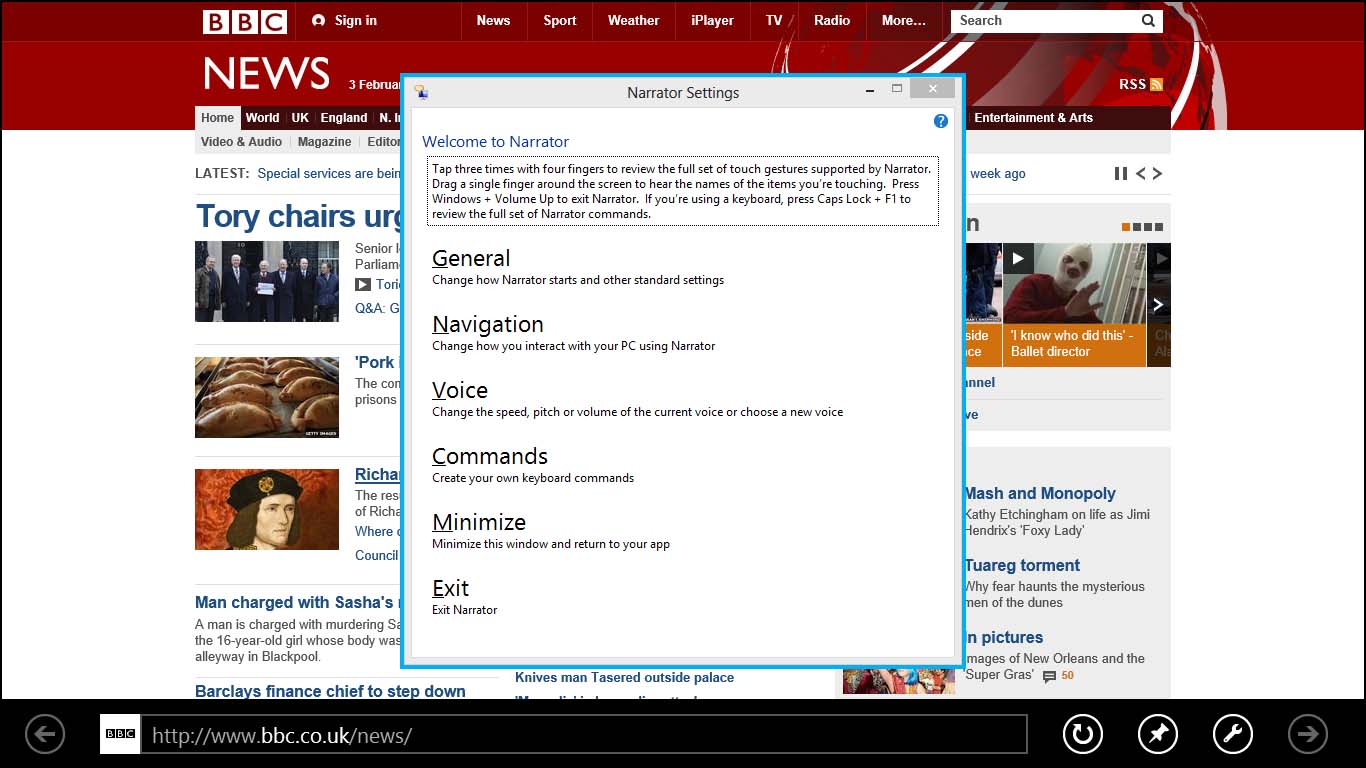 I was trying to get to grips with how the Modern UI version of Internet Explorer worked (there are two independent versions of IE in this operating system). Somehow I did something, and the dialogue box you can see above in the middle of the screen showed up. Looks like classic Windows, doesn’t it? That’s because it is. Here the Modern UI has just been unceremoniously shoved out of the way. I prodded the X to close the dialog box. It didn’t work. I tapped on Exit. It lit up blue, but wouldn’t do anything. In the end, I attached the keyboard and used the mouse pad to navigate to the X to close the Window. That did the trick. Told you the keyboard wasn’t really optional.
This happens quite a bit. I found old school (i.e., uninformative) error messages in the Games section. The version of Microsoft Office that’s installed immediately drops you out of the Modern UI and into the desktop version of the operating system. From there you can use a desktop version of Internet Explorer, which is so much better than the Modern UI one, even if it’s a bit harder to use the touch interface. Amusingly, if you choose to customise the desktop look and feel (which you can do whatever you want with by the way), downloading a Microsoft themepack will take you out of the desktop into the Modern UI, fire up that version of Internet Explorer, download the file, and then promptly drop you back to the desktop where the stuff will install. It makes no sense at all. The apps on the start screen could be Modern UI ones, or Desktop ones. You can’t tell.
Now before I give you my thinking on what’s going on here, a quick word about the touch gestures. They are hard work. Even now, with over a week of usage under my belt, I’m still not doing things right. A swipe pull up that wretched Charms Bar when I don’t need it or doesn’t when I do. You have to swipe up from the bottom of the screen for things that slide down from the top. To get a list of running Apps you have to swipe in from the left and then back again quickly. Although it always seems to recognise touches (with a nice contact circle to let you know — I like that) it doesn’t always do anything with the input. Repeat prodding at things is a common occurrence. And the edge of the screen is an active context-aware zone, which means you swipe into and out of the screen surround to get things to happen. And that’s just not a great tablet interface — in holding the thing, you put your fingers where the screen surround is.
When one compares and contrasts with either the Apple or Google Nexus interfaces, the Surface comes last. It’s not even close.
So what’s going on here? I’m told that under the hood, Windows 8 is quicker, has better power management, does clever things with device and cloud storage, and has all sorts of great optimisation. I thought what we could be looking at here was a unified development environment where you could build an App and have one defined UI for a desktop user and another for a Tablet user, within the App if you wanted. That would have been brilliant. As a publisher, you could have looked to do some really great products that would work across the Windows ecosystem regardless of whether it was a phone, a tablet, or a desktop. Right there, following a user across their workflow devices could have got a whole lot easier.
What we appear to have instead is a pretty crude touch UI slapped over the standard desktop interface. It’s clear, both in the hardware and the software, that this isn’t really a tablet at all. It’s a specialised laptop with a detachable keyboard. And it’s really expensive for what it is. There’s a bit of touch. But this is in a world where Apple and Google are doing voice and face recognition and competing hard with each other to redefine the user interfaces of the modern era. As I write this, the latest video for Google Glass has just come out. Voice-controlled, GPS-aware, gyroscope, and eye movement as additional inputs, a minimal UI projected onto your field of view. It looks incredible. I look at Windows 8 and the Surface, and I feel a bit sorry for Microsoft. It seems to me that they are really struggling with the fact that the form and functions of a tablet, or any context-aware device, are a fundamental shift away from the previous paradigm. Shifting awkwardly between Modern UI and desktop interfaces just doesn’t work, and there’s no sense that they know when to do which. We’ll probably have to support this, but it’s hard to work up much enthusiasm.
I’ll leave you with two things that sum up brilliantly both the hardware and the software. On this 32Gb Surface, only 15Gb is actually available for your stuff. The rest is the operating system and other cruft. This is unacceptable. iOS 6 occupies less than 1Gb on an iPad. And finally here’s how you turn it off: 1) swipe in the Charms Bar, 2) touch Settings, 3) touch the power symbol, 4) touch the text that says “Shut down.” Then, and only then can you turn the machine off. There’s a power button on the machine. Why on earth couldn’t they have used that.


Discussion
3 Thoughts on "Is It a Tablet? Is It a Laptop? Digging Into the Microsoft Surface RT"
Thanks
Not surprised. Aside from ads and PR is this built to be just what you described? Laptop w touch. Do you see it as a fit in the average work environment where folks are using Office and email on a desktop or laptop?
Emphasis on the word “average”. Is it a good machine for the day to day-for someone who may use it primarily in one location. The ergonomics are still important and it seems they are a bit off lacking. Curious to see if there is still a need for this type of machine in companies, once purchasing dollars begin to flow again.I also know of companies on both sides of the Atlantic which are just
upgrading to Office 2007 Could it be better, of course.