Note from Scholarly Kitchen Chef Lisa Janicke Hinchliffe: I’m pleased to introduce today’s post from Rebecca Springer and Danielle Cooper of Ithaka S+R. I happened upon a Twitter conversation where they were sharing some of the workflow diagrams they have collected and asked if they would share them with our community. I hope everyone will enjoy the visualizations but even more so that they will take note of the emerging taxonomy of image types. Rebecca is a qualitative analyst with Ithaka S+R’s Libraries, Scholarly Communication, and Museums program, where she draws on her research and teaching experience to develop and communicate scholar-centric insights into information technologies. Danielle is the senior qualitative researcher at Ithaka S+R, where she focuses on how information practices are evolving in higher education.
***
It is no secret that some of the major players in scholarly communications are pivoting toward offering support for research processes beyond publishing. Universities, research funders, and librarians are increasingly invested in shaping research processes as well, especially amid growing concerns over the challenges of responsible research data management. It is not surprising, then, that the higher education information sector has become invested in understanding scholars’ research processes holistically — as “research workflows.”
But how much do we really know about these research workflows? One way to answer this question is to examine visual depictions of scholarly processes. Research workflow diagrams are everywhere: in peer-reviewed articles, online research reports and issue briefs, and blogs like the Scholarly Kitchen. These visualizations present a dizzying variety of content and design. In order to make sense of it all, we outline two key themes that can help ground an analysis of research workflow diagrams: how the “flow” is structured and who/what is centered.
Structuring Flow
Diagrams of the research process generally fall into one of three categories: linear, non-linear, and cyclical. These categories reflect an underlying tension: is it more important to acknowledge the iterative quality of research, or to highlight common research processes and outputs? In order to explore this tension further we provide examples from each of three main categories below.
Linear
An archetypal example of the linear genre of workflow diagrams is Chef Roger Schonfeld’s schematization of the research process of laboratory scientists. In this post, Roger (who is also our Ithaka S+R colleague) underlines the need for academic information professionals to pay attention to the entirety of scholarly work process, from keeping up with the field to post-publication engagement and evaluation. His diagram doesn’t represent variations in research practices among researchers; instead it emphasizes that research is a long, multi-stage process for everyone.
Non-Linear
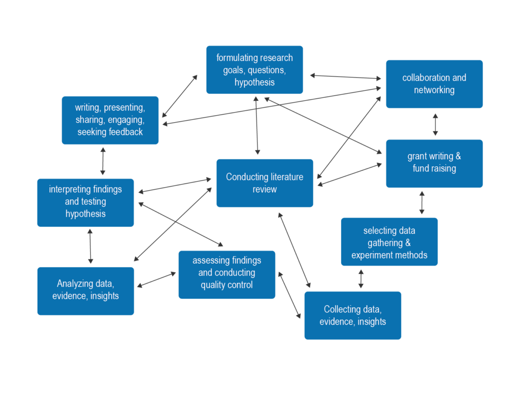
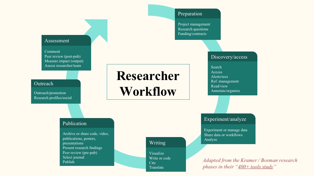
By contrast, Danielle Cooper and Oya Rieger use this diagram to emphasize the “iterative and non-linear” nature of scholarly research in order to argue that, although all scholars are in a sense “collectors” of information, the ways in which they use this information — and, accordingly, their support needs — vary widely. In their formulation, research does not have a clear beginning or end. The immediate effect of this workflow diagram on the viewer, at least at first glance, is confusion — and this is precisely the point.
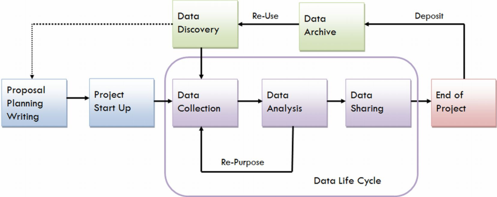
Cyclical
The University of Virginia Library’s Research Data Services + Sciences webpage presents a cyclical view of the STEM research lifecycle, highlighting how data management is one part of a larger, repeating process. While this diagram nods to potential variations, such as the reuse of deposited research data for analysis within an existing project, in general it presents a view of research which begins with a project proposal, ends, presumably with a published output, and then restarts with a new project proposal.
Picking a Vantage Point
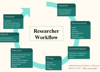
The content and shape of any single diagram largely depends on its audience and purpose. Implicitly or explicitly, workflow diagrams choose a particular entity’s vantage point, and describe only select aspects of that entity’s work or context. The most common example is the diagram which centers the researcher and describes stages of the work which that researcher does. The three diagrams described above are examples of this type, as is the diagram Chef Lettie Conrad included in her Scholarly Kitchen post on mapping open science tools. But it is also possible to create diagrams which chart the creation, evolution, and transmission of information, or to relate research processes to products, systems, and institutions. We provide examples of these other approaches below.
Information Flow
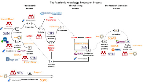
This diagram, from a conference paper by Alejandro Posada and George Chen, is intended to communicate the extent to which Elsevier has pivoted to providing products which support scholars throughout the research lifecycle, rather than merely at the publication phase. The visual effectiveness of the diagram is undeniable, but its interpretation depends on the perspective of the viewer. While some might decry the apparent success of Elsevier’s “rent-seeking” tendencies, to quote the authors, others might applaud the company’s strategic vision in recognizing the full scope of the information dissemination process.
Platform
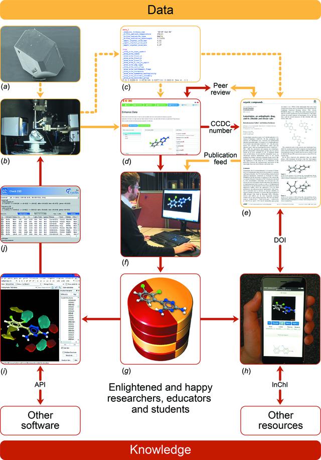
In contrast to the previous example, this diagram from an article by Colin R. Goom and coauthors centers a single platform, presenting research activities and data processes only as they relate to that platform. The Cambridge Structural Database, hosted by the Cambridge Crystallographic Data Center, stores the coordinates of atoms for crystal structures, and is widely used by chemists. The diagram is highly technical in nature; most of what it depicts can only be interpreted with access to the explanatory text provided by the authors. However, it also communicates a simpler, rhetorical point: the database transforms data into knowledge, resulting in “enlightened and happy researchers, educators and students.”
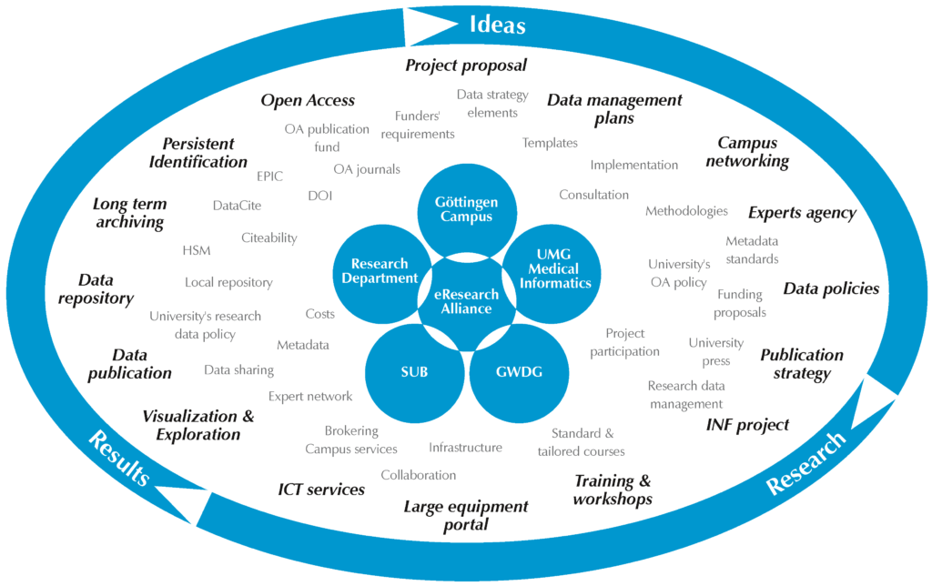
Organization
This diagram quite literally centers the eResearch Alliance, a collaboration of organizations within the Göttingen University campus which includes the library, IT center, and medical center. Working from the inside out, the diagram relates the Alliance’s services and areas of expertise to phases of the research lifecycle, itself schematized as a three-stage, cyclical process. The purpose of this diagram is not to detail specific aspects of the scholarly workflow, but rather to illustrate the array of services which a cooperative, campus-wide initiative can provide to researchers.
Final Thoughts
Scholarly workflow diagrams are a useful window into how libraries, publishers, and other stakeholders are trying to understand scholarly practices — and how they can do a better job serving researcher needs in the future. However, it is important to recognize that these kinds of modeling exercises often tell us more about our assumptions about research processes than they do about how scholars actually do their work.
There is much room for growth in this genre, particularly in using research about scholarly practices to inform how models are constructed. Evidence-based workflow diagrams would be especially helpful for identifying barriers to providing optimal research support and generating solutions. The hypothetical workflows derived through the 2015-2016 survey from the Innovations in Scholarly Communication project at the University of Utrecht is a promising example in this direction. It could also be interesting to develop a more systematic analysis of how researchers visualize their own workflows, building on some of the exploratory diarying and cognitive mapping methods used in UX- and ethnography-informed library studies.
Of course, the diagrams we highlighted here in no way represent a systematic collection; instead, we’ve built up a curated personal collection over time. We’d love to see examples of workflow diagrams others have found helpful in understanding how scholars do their work. We’d also love to hear your thoughts about how the genre of the workflow diagram can be further developed.
Discussion
5 Thoughts on "Guest Post — Pictures Worth a Thousand Words? On Visualizations of Scholarly Workflow"
Fantastic collection of perspectives on research workflows! So helpful to have this all in a place. Thank you. I would also just point readers to another visualization which many are likely to be familiar with – 101 Innovations in Scholarly Communication by Jeroen Bosman and Bianca Kramer librarians at the University of Utrecht who have collected several useful, simple visualizations about technology tools and the research communication workflow. A
Oh, I see that we linked this in the blog post under under the project’s formal rather than more commonly known name – apologies for any confusion (and yes, we are great fans too!)
Great collection of ideas in pictures. I like the comment that they reflect assumptions rather than practice. I was surprised that metadata and or the explicit documentation process is missing from all but the last of these diagrams even though I suspect that all authors, and most readers, would agree that metadata is the blood flowing through the veins of these processes. The data life cycle picture you used to illustrate cyclical process is my favorite. I used it in a discussion of the roles that metadata play in these cycles at https://doi.org/10.3390/geosciences8050179.
I found the last two difficult to view, but I am surprised that prepublication editing (both copy editing and more substantive editing) does not seem to be mentioned – such an important step. Responding to queries stemming from that editing, whether during the editing phase or proof phase, is also often crucial for authors to clarify their work for readers.
I greatly enjoyed this post, thank you! My dissertation explored research workflows, and I found immediately that one of the greatest challenges was how discipline-specific or discipline-general to be. If trying to map a workflow that can apply to art history and to physics, it is necessary to take a much higher-level approach than if one is focusing in only one area. I believe both are necessary and appropriate depending on the context and need. To some extent, it is necessary to grasp the big picture concepts, such as the role that environment and collaboration play in research productivity, before the implications of the details of data management can be fully understood. I found the non-linear approach to be most supported in my work (see the visualization at: https://doi.org/10.1016/j.acalib.2016.01.003).