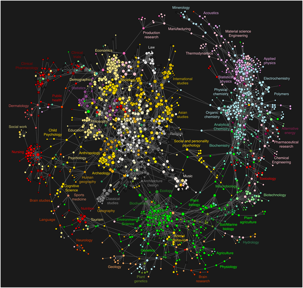
Every time you conduct a search, click on a link, or view a document, you leave a trail. By aggregating millions of these clickstream trails, it’s possible to generate a map of collective behavior — a usage map of science.
A new article by Johan Bollen and others at the Los Alamos National Lab, “Clickstream Data Yields High-Resolution Maps of Science,” was published on March 11 in PLoS ONE.
Bollen is the principal investigator of the MESUR group, which focuses on usage-based research. Last month, we reported on this group’s work comparing scientific impact measures.
Aggregating link resolver logs from all 23 campus of California State University, the University of Texas (9 campuses and 6 health institutions) plus usage logs from ISI’s Web of Science and Elsevier’s Scopus, the researchers created a massive dataset — nearly 350 million individual user interactions covering nearly 100 thousand serials including journals, magazines, and newspapers.
Their goals was to create a map of the relationships among journals. While the mapping of journal relationships using citations is several decades old, using clickstream data makes this article novel. The authors write,
the immediacy of log datasets offers the possibility to study the dynamics of scholarship in real-time, not with a multi-year delay, as is currently the case with citation data.
Not only can usage data create a more current map of science, most usage never transpires into a citation, making a usage map a more complete picture of activity. Or put another way, analyzing citation behavior misses a much broader population of readers beyond active researchers, such as undergraduates and practitioners.
From the transaction data, Bollen and others created a clickstream model of journal relationships. In simple language, two journals (A and B) are related if you started at an article in A and clicked through a link to an article in journal B. Creating the journal matrix and the rules to plot the data is technical and involve several data-intensive steps. Those interested in the process can read their methodology.
The result is a map where the nodes (circles) are journals, their relative size and position indicate their centrality among other journals, and the edges (lines) between them indicate strong relationships.

To understand the map, the authors use a metaphor: the inner “hub” is a tight cluster of social sciences and humanities journals; the “outer rim” consists of clusters of journals in the natural sciences; and “spokes” connect the hub to the rim.
The location of the social sciences and humanities in the center of the map is a surprising finding, to say the least. Citation databases tend to marginalize these fields. Yet we need to remind ourselves that we are not looking at the citation behavior of a select group of published authors, but the collective action of users, in which students outnumber faculty by 10 to 1.
The authors discuss some of the limitations of their study, including the fact that each online product in their aggregate database may be expressing a unique interface effect, thereby affecting patterns of clickstreams. Secondly, they do not make a distinction between the many ways users move between one article an the next (from citation links, search results, recommendations, etc.). That said, we should consider this article to be one of exploration, rather than hypothesis testing.
Commenting on the paper in the journal Nature, Carl Bergstrom created a nice analogy on what a usage map adds to our understanding of science,
Usage data tell us where the net was cast; citation data tell us where the fish were caught. If you want to understand the human enterprise of fishing, you had better know about both.
Discussion
1 Thought on "Usage Map of Science"
Nice image, but can anyone explain why it’s useful?
![Reblog this post [with Zemanta]](http://img.zemanta.com/reblog_e.png?x-id=bdcf6a22-d695-4f46-8e64-3cd21a2f51a9)


