Earlier this year, the National Science Foundation released its 2016 Science & Engineering Indicators report, which provides a snapshot on the current state of the science and engineering workforce, funding, and research.
While the report does an impressive job summarizing the data, it does an extraordinary job linking text with tables, figures, and data sets. For those in publishing, Chapter 5 (Academic, Research, Development) provides detailed publication output by field, country, and region. Too often, unfortunately, the report struggles to describe the complexity of the data, leaving us with a multitude of disparate figures illustrating just one or two variables at a time (for example, output by time, by field, by country).
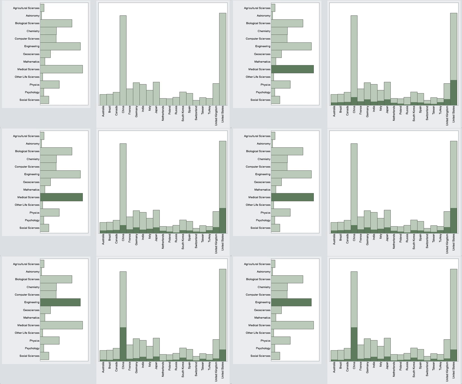
Assembling 14 of the report datasets, I was able to create an interactive dashboard that allows a reader to select from multiple dimensions of the data in order to view individual trends. Regrettably, WordPress, the host of The Scholarly Kitchen does not permit us to run the scripts directly from this post; however, the HTML files (Fig 1, Fig 2) can be downloaded and run from almost any web browser. Below are two animated GIFs to provide a sense of how it works.
Selecting a region in Figure 1, for example, North America, provides a snapshot of article growth from 1999 through 2013, along with a distribution of the papers published by field. Not surprisingly, North America and Europe have very similar field publishing profiles, both excelling in the Medical and Biological Sciences. In contrast, the largest share of papers coming from Asia are in Engineering.

Focusing on the top 20 countries in 2013 (below), the United States still tops China in total number of papers published; however, Chinese authors published more nearly three-times as many Engineering papers as the United States. In contrast, the United States published about ten-times the number Social Sciences papers as China.

It’s tempting to editorialize on cultural values and reward systems that may lead to these differences, but I also wonder whether the source of the data (Scopus) may simply do a better job indexing some fields over others or Western journals over regional Chinese journals. Readers are welcome to comment on what factors may result in these patterns.
Notes: The data source (Scopus) provides fractional authorship counts, meaning that a paper authored by two Americans, one German, and one Chinese researcher will assign 50% authorship to the U.S. and 25% each to Germany and China.
Discussion
1 Thought on "World Article Publishing Illustrates Regional Values"
Alongside production of the bibliometric data for SEI 2016, Science-Metrix prepared a report that explores the variations in the methods used for the 2014 edition compared to the 2016 edition, and the impact on the resulting statistics. This includes the potential impacts of the shift to Scopus for the latest edition.
You can find the report here: http://tinyurl.com/zwdrg89
This should provide some useful baseline information to start the discussion!
By and large, Scopus includes more documents than the Web of Science. Furthermore, only a subset of the Web of Science was used in the previous editions of the SEI. Scopus also offers a more balanced representation of fields, and this extended coverage appears to offer a better basis to compare the production of countries. For example, countries that are very active in the Applied Sciences but not that much in occidental biomedical research (e.g., China, Iran, Malaysia) have a fairer comparison with countries where Life Sciences are at the forefront (e.g., the U.K., the U.S., Sweden). Also, Scopus covers more non-English-language journals and more regional journals, which also tends to provide a better representation of emerging countries.
These conclusions only hold true for now, though: both providers are highly engaged in improving the content of their databases and only time will tell how they evolve.


