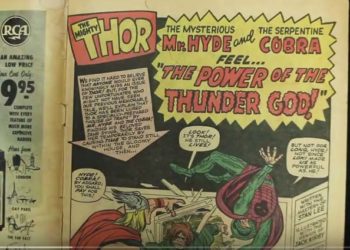
Comic Sans remains one of the most vilified fonts on your computer (although Papyrus has been gaining a good deal of derision in recent years). Using the font in anything other than an invitation to a child’s birthday party has been described as, “analogous to showing up for a black tie event in a clown costume.” But how did this font come about, and what was the thought process behind its design? The short video below introduces Vincent Connare, father of Comic Sans, who still describes it as, “the best thing I’ve ever done.”

David Crotty

David Crotty

David Crotty is a Senior Consultant at Clarke & Esposito, a boutique management consulting firm focused on strategic issues related to professional and academic publishing and information services. Previously, David was the Editorial Director, Journals Policy for Oxford University Press. He oversaw journal policy across OUP’s journals program, drove technological innovation, and served as an information officer. David acquired and managed a suite of research society-owned journals with OUP, and before that was the Executive Editor for Cold Spring Harbor Laboratory Press, where he created and edited new science books and journals, along with serving as a journal Editor-in-Chief. He has served on the Board of Directors for the STM Association, the Society for Scholarly Publishing and CHOR, Inc., as well as The AAP-PSP Executive Council. David received his PhD in Genetics from Columbia University and did developmental neuroscience research at Caltech before moving from the bench to publishing.

Discussion

1 Thought on "The Rise and Fall of Comic Sans"

Ask the teaching profession. Comic sans is the chosen font in many UK schools for lesson plans, three year strategy plans and other documentation only ever read by adults. Is this a global phenomenon?
Comments are closed.