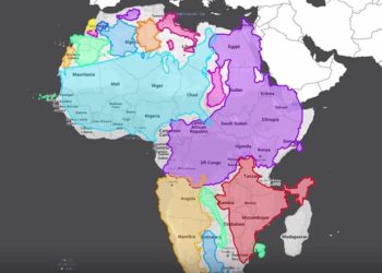
Human brains are generally not great at dealing with scale — at least it’s hard for us to wrap our heads around really big numbers. In the past, we’ve looked at different data visualization methods for scale, ranging from the size of countries to the size of celestial objects. The video below looks at human populations, and presents things at an understandable level by scaling down the world’s population from 7.5 billion to 100 people. These smaller numbers make clearer things like geographical distributions, as well as the deeply problematic levels of wealth inequality that exist. Also of note, more people have cell phones than have toilets.

Discussion
1 Thought on "Data Visualization and Scale"
Note the possible error in the lead in? Also, where is the data that was used for these statistics noted? Disappointed that this came across without more warning that it is an ad.
Data Visualization and Scale
Jun 16, 2017 by David Crotty
Data Visualization and Scale
A clever visualization that makes it easier to understand statistics about human populations be reducing their scale.