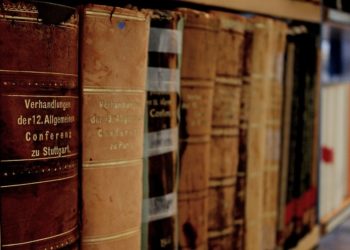
Earlier this week, The Guardian covered a recent round of Twitter discussion from famous authors, in which author Sean Richardson asked, in which font and in which size do you write? The results were entertainingly varied, evoking strong emotional responses. As Richardson notes, ““The reaction to the tweet is fascinating because it goes beyond personal preference and into questions of identity, accessibility, place, accent and style.”
The article also quotes designer Sarah Hyndman:
The font you use is a form of non-verbal communication,” she said. “If you meet in person, tone of voice, clothes and body language carry a huge amount of information. If you write someone a letter you have all these tools available in your handwriting. But as soon as you sit down at a computer, especially if you’re working in a program that defaults to Times New Roman, we suddenly become identical and we don’t like that.
Hyndman gave a great talk on typography which you can find below. She discusses how typography is storytelling, and can be used to reveal truths or create myths, which can be used both for good and nefarious purposes. I particularly like the section where she asks you to picture the letters in famous logos, and experience the feelings they evoke without even being seen. And her retelling of Star Wars in 15 fonts is great fun.
Do you have a favorite font for writing, and if so, why?
Discussion
9 Thoughts on "Typography Turns Words into Stories with Influence"
Excellent TED talk. I use Palatino for all my Word documents, but cannot give a sensible explanation as to why I like it. Just a gut feeling.
Me too! Palatino is my go-to. I use it for the journal I edit as well, and this is our colophon on our font choices:
The main body of the text of Mythlore is set in Palatino Linotype, a balanced and graceful lyrical modernist face created in 1948 by Hermann Zapf and based on humanist Renaissance designs. It was initially cut by hand and cast as a foundry type, even though phototype machines and early computers were in use at the time. This combination of modernism and deliberate anachronism, as well as the date of the type’s design, makes Palatino especially suitable for studies of the works of Tolkien, Lewis, Williams, and other modern fantasists. Mythlore first started using Palatino in 1988, when it switched to computer typesetting. Starting in 1989 a face called Tolkien, adapted from Kelt, was used for titling for a number of years but later phased out. We have returned to Tolkien for titles and other accents. Selected passages in Old English may be set in Junicode, which includes some necessary specialized characters and ligatures not included in the Palatino character set.
For those who love stories about fonts I can recommend this episode of the brilliant Futility Closet podcast https://www.futilitycloset.com/2017/09/04/podcast-episode-168-destruction-doves-type/
I am only a sans serif type of type. I do not have little feet that want to get planted anywhere.
For both Word documents and email, 12 point Garamond, which is actually very similar to 11 point Palatino (look at both side by side). As for why, MANY years ago, I looked at all the fonts available to me, narrowed it down to three or four I liked, then from there settled on Garamond.
I’m loving the love for Palatino in this comment thread. For scientists, at least, it’s the ideal font: it’s free (well its clone URW Palladio is), its professional (so it contains all kinds of symbols and alphabets you might not get with other fonts), it’s elegant without standing out, and it works well with LaTeX.
Paraphrasing myself from my post: http://brushingupscience.com/2018/06/14/palatino-and-source-sans-pro-the-only-fonts-a-scientist-needs/
This is so brilliant. I thoroughly enjoyed how she made fonts sound so relatable. And it’s so true that we internalise a lot of typography and associate it with emotions and feelings. Especially the last part that she wove into a Story with the same word being represented in different fonts to depict different situations/settings. Very enriching.
Excellent Talk on Typography. We too do tell stories of the services we offer using just an artwork and fonts.
A tour de force of typography can be seen in the video for the very catchy “It’s Loud with the Shop-Vac on” (Song by Jonathan Coulton, video by Jarrett Heather https://www.youtube.com/watch?v=y4sOfO8Ei1g
