Editor’s note: Today’s post is co-authored by Lisa Janicke Hinchliffe, TSK Chef, and Kalyn Nowlan, an MS/LIS candidate at the iSchool at University of Illinois Urbana-Champaign who also works at Funk Library, which supports research for the college of Agricultural, Consumer and Environmental Sciences. When Kalyn graduates in May, she is interested in pursuing academic librarianship, with a focus on scholarly communications and supporting student success.
Publishing platforms typically use certain indicators, such as standardized text or symbols, to indicate whether articles in hybrid journals are open access. This communicates to users whether they can access the articles without a subscription or paying a per-article fee. These indicators are important to the publishers and the authors; communicating what type of access a user has to an article may influence the article’s reach. Librarians also rely on these indicators to properly assist those who are using these publishing platforms. Yet, in spite of these indicators, we have noted that users are often confused about whether they have access to an open access article. Something about the signaling is not communicating as intended.
Over the past months, we have conducted a pilot investigation into the signals used on a sample of platforms. Our analysis revealed that this aspect of the user interface is not standardized across the industry nor are symbols and text phrases always used predictably within a given platform. Industry initiatives such as Seamless Access and GetFTR have attended to questions related to consistent user experience with authorization and indicators for access for subscribed content. In today’s post, we bring attention to the uneven user experience with signals indicating open access content.
In designing our inquiry, we were guided by two research questions: (1) how do publishing platforms indicate which articles are open access, and (2) is there consistency in the indicators used within and across scholarly publisher platforms? We believe this multi-platform analysis is particularly important as most users must navigate multiple sites during their research journey and so the user experience is not in the control of any single publisher. We selected five major publishers for our analysis: Elsevier, Springer, Wiley, Sage, and Taylor & Francis. As some of the largest academic publishers, their platforms are likely to be used, at least at some point, by the typical faculty member or college student user.
Methodology
To determine how open access is indicated in the table of contents display, we selected one journal from each publisher. After downloading a current journal list for each publisher, we selected the first hybrid journal listed that was actively publishing in 2020 and located the first issue of that year that contained both open access and paywalled articles. We chose the early 2020 timeframe to ensure that any delayed open access papers (e.g., to comply with U.S. public access requirements) would be open. We went to the table of contents for the issue and noted how open access is indicated for the listed articles.
To determine how open access is indicated in search results, we conducted a keyword search on each platform. We used the term “pandas” as an example search term, which brought up articles from multiple journals in multiple disciplines as the term can refer to an animal, it is also a term used in software programming and pediatric medicine, and it is used as slang. We then looked for open access indicators in the results, browsing through multiple screens if necessary in order to locate an open access article among those displayed.
We organized our data in a spreadsheet by scholarly publisher (Elsevier, Sage, Springer, Taylor & Francis, and Wiley), and documented the results for each type of search (table of contents or keyword), the open access indicators in use, and, to differentiate as well between open, free, and subscription access, recorded whether a paywall or other indicators were used. We also captured screenshots or saved as a PDF each displayed screen used in analysis.
We collected pilot data in May and June 2022 in order to develop our methodology. We revisited the platforms in September and October 2022 to collect the data used in this analysis after noting that some publishers had updated their interfaces since the original data collection.
What We Found
Reviewing the table of contents and keyword search results, we saw that, for the most part, these publishing platforms had internally consistent open access indicators. The indicators used were consistent regardless of whether we were viewing a table of contents or the results of a keyword search. However, indicators varied greatly across publishing platforms, with different terminology, colors, and symbols in use. We also found that open and paywalled access were not the only kinds of access that were indicated; some platforms provided third or even fourth options. These additional types were indicated with various phrases such as “full text access,” “free access,” or “available access” and with very little explanation about what differentiated these kinds of access from open access.
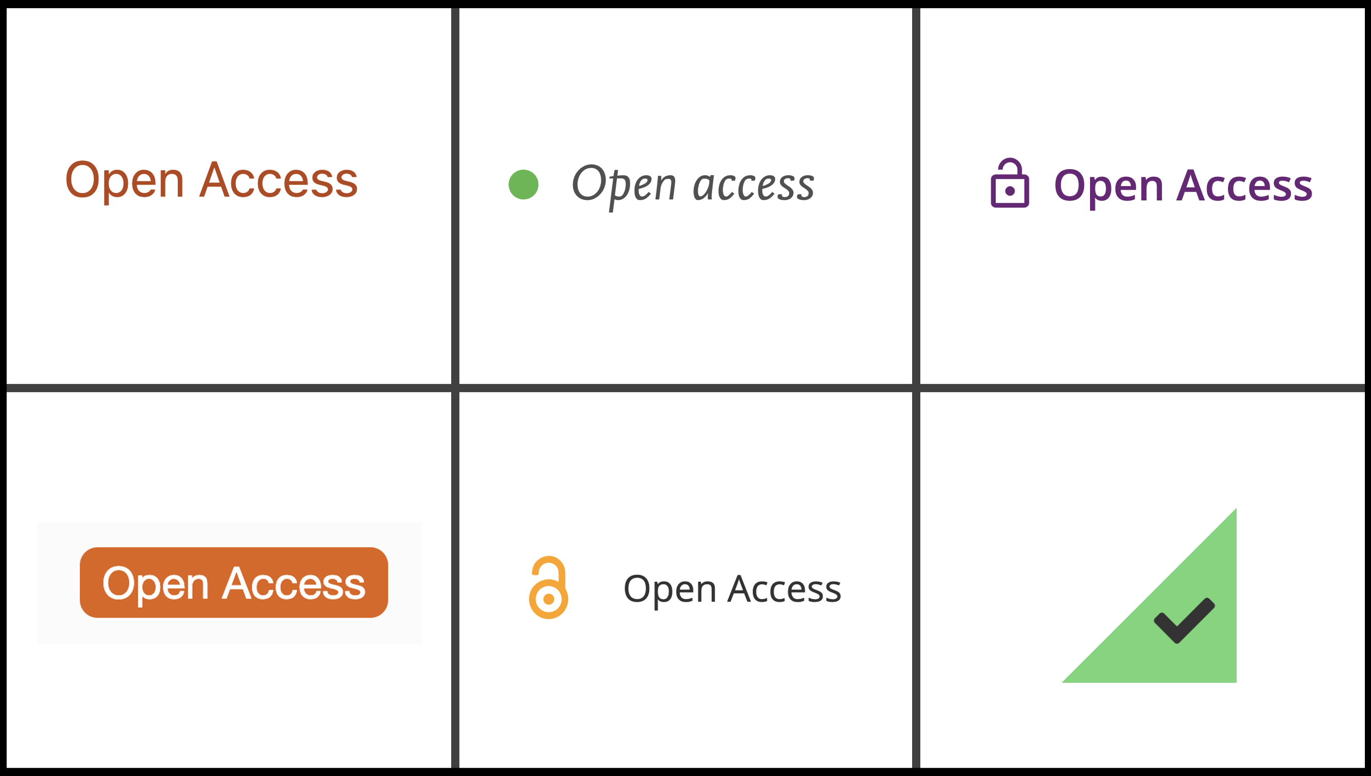
In the table of contents, Elsevier’s indicator is a green dot with text reading “Open Access.” The green dot indicator is used in the keyword search. The same green dot indicator also appears with the label “Full Text Access.” Whenever the green dot appears, so did a PDF icon and the text “Download PDF.”
In the table of contents, Sage’s indicator is an orange unlocked icon with the text “Open Access” and a PDF/EPUB download icon. The same indicators are used in the keyword search results display. Another type of access is indicated by a green unlocked icon with text that says “Free Access” and the PDF/EPUB download icon. Sage also overtly labels non-open/non-free articles with the label “Restricted Access” and a black locked icon.
In the table of contents, Springer’s indicator is orange text that says “Open Access.” In the keyword search, Springer uses an orange box with white text that says “Open Access.” Thus, Springer is consistent in use of color – always using an orange and white combination – but not consistent in which is background and which is text color.
Taylor & Francis displays each item in a table of contents or search results set in a box that offsets it from the page background. Indicators for access are in the lower right corner of an item box. For open access articles, Taylor & Francis uses an orange triangle with an unlocked icon in both tables of contents and keyword search displays. The term “Open Access” appears next to the triangle as a mouse-over. A green triangle with a checkmark in it also appears in the displays and the text “Free Access” shows upon mouse-over.
In the table of contents, Wiley’s indicator is purple text that says, “Open Access” and an unlocked icon. The same indicator is used in the keyword search. Another kind of access is indicated by blue text that says “Free Access” accompanied by an unlocked blue icon. We observed that Wiley does use the unlocked green icon seen on other platforms. However, Wiley does so accompanied by the label “Full Access” and this is when the user has subscription-based access to content.
All of this was quite challenging to investigate and document. It involved hours of searching, capturing screen, clearing caches, incognito browsers, deleting one’s data from SeamlessAccess, and being vigilant to GetFTR powered links in order to reconcile our interpretations. As such, though we have sought to be accurate in our portrayals here, we share our findings with our acknowledged limitations. We welcome corrections to any errors in our interpretations in the comments to this piece. And, we would also suggest that such errors be seen as further evidence of just how confusing the signals and indicators are.
Implications
The data collected provide evidence of internal consistency of open access indicators on a single platform and overall cross-platform inconsistency. A publishing platform was deemed internally consistent if it has the same open access indicators on the table of contents and keyword search results. A platform was deemed internally inconsistent if the open access indicators are different in the table of contents and keyword search results. The only platform that did not have complete internal consistency was Springer, which used the same text and colors but inverts orange/white for text and background.
Elsevier, Sage, Wiley, and Taylor & Francis all had internal consistency; however, the symbols that they used to indicate open access differed significantly from one another. There were some similarities, such as the locked/unlocked imagery and download icons in Sage, Taylor & Francis, and Wiley, but the difference in colors and shapes were notable. When users are navigating through multiple platforms during their research process, not having universal symbolism for open access has the potential to slow them down and create confusion.
Another confusion is an absence of information to help a user distinguish among open/free/full/available/etc. access. Sometimes it is not clear whether the user has “free access” or “full access” to an article because they are affiliated with an institution with a subscription or because the article is open for reading for everyone. And, open access is indeed a kind of free access, but the inconsistency in terminology is likely to cause confusion.
With Sage, whether a user has logged into the platform through their institution will impact the indicators that they see; if they are at a subscribing institution, a new label – “Available Access” – appears accompanied by the green unlocked icon. This means that collaborating scholars who are accessing the platform in different ways – unauthenticated or authenticated/unentitled vs authenticated/entitled – will see different indicators for the same article. Elsevier’s green dot may also confuse. While the green dot consistently indicates that the user has access, the green dot is associated with both “open access” and “free access” terminology as well as the “full-text access” that reflects a subscription-based entitlement.
Though the open access indicators in use within a given publishing platform are relatively consistent, this investigation documents that there is significant inconsistency across the platforms. Publishers use different colors, symbols, and terminology to indicate open access. They also use a variety of symbols and text to indicate other kinds of access that are free but also – one infers –in some way different from open access. Encountering such a wide array of symbols and terminology seems likely to create confusion about whether users can access certain articles and why. This is also a burden for expert users, such as librarians, who are navigating different platforms as they have to orient themselves repeatedly to different sets of indicators.
Those of us in the library and publishing fields may understand the differences among terms like “open access,” “full text access,” “available access” and “free access” (or at least can usefully hypothesize about them); but, those outside of our professions likely will not. Efforts to better explain access indicators on a given platform would decrease user confusion. But, even better would be a shared taxonomy of indicators and texts implemented across the industry to improve the user experience.

Discussion
15 Thoughts on "A Failure to Communicate: Indicators of Open Access in the User Interface"
Thanks Lisa, interesting research, did you also look at the underlying metadata, is that consistently tagged as OA, and if so, is there also potential to use those tags and data consistently, systems wise or machine readable? I realize this part may have been out of scope for this end user/UX style study, but an interesting thought?
Thanks Adrian. As you guessed, this was out of scope for our study but it’s a great question. I suspect there is underlying metadata but whether there is uniformity in the tagging definitions is probably the bigger issue?
Whether a paper is open access also influences a journalist’s propensity to write a news story about it – and not just for the sake of the journalist’s convenience. It’s nice to give readers the ability to consult the original paper without their having to go through a pay wall.
Great article, thanks! Somewhat tangentially, we on the Project COUNTER Technical Advisory Group (TAG) have been working for well over a year now on how to further clarify for usage data reports the differences between licensed access, open access, and other kinds of “free to read” access. Once you get into the weeds of trying to come up with a schema that incorporates everything a publisher/platform might decide to do, it gets very complicated, some of which you touched on in this article.
As a librarian who is also involved in verifying that our licensed access is in place, I find it very annoying when a platform uses the same icons/labels for “open access”, “free because of your license”, and “free to everyone because we feel like it but could revoke at any time” (think of the free access to some Nature journals after their first-year embargo, or many publishers providing short-term free access as a marketing tool for that journal).
Perhaps pressure from Project COUNTER to make those distinctions in collecting usage data will effect change in their user interfaces as well. That won’t come until release 5.1 which is quite a long time away since we need to give vendors time to retool their software to comply with all of the changes, not just this one.
We were a bit surprised by just how many different statuses articles have on some platforms. We attempted to unpick them and figure out the differences but we ultimately decided to focus on just the open access indicators, which was our original interest. What was particularly interesting, and would be an easy win if remedied, is how often there is no key, help file, or anything to inform even an expert user (e.g., a librarian) about what the differences might be.
Even more opaque to users is the “version” of open access that the article is licensed under (CC-BY, CC-BY-NC etc). As a corporate librarian we spend much time and money educating our users about copyright in order to make sure we remain complaint. There are differences for my users as to what they can do with articles depending on the CC license type, yet this information is rarely “human readable.”
The metadata that publishers place in CrossRef also doesn’t reliably indicate that an item is open access. Many articles list no license in that field, which can mean either public access or paywall access. So for a funding organization that tries to use CrossRef metadata to see all the materials they funded, they can not then indicate which are public.
This is a useful piece of work; thank you. I’m betting the indexers have even more icons to denote Open Access, increasing the confusion of researchers.
Recommending a standard for indicators like a good project for NISO!
Yes, I was about to say the same thing!
If there’s interest, you all know how to get in touch with me. I’m happy to set you all along the path to making this happen.
It is worth noting that there was a discussion along these line when we launched the NISO Access and License Indicators (ALI) project which settled on the comparatively easier problem of describing the metadata for whether an item was “free to read” and what it’s license terms were. The NISO ALI metadata is in common use these days and could be associated with visual representations, if the community were to agree.
A very apt research on a facet which has an impact on retrieval in open access landscape. It must serve as an eye opener for professional to ensure that open access blooms in days ahead to the satisfaction of one and all.
I don’t get how this can possibly be an issue. Click the link to get to the article page, and then if you can read it, and you have no special license, it’s open access.
Does anyone really assess whether a paper is open access any other way? I can only think of one, exceedingly out-of-the-way example of how this could cause confusion (scrolling through recent articles on a journal page, as if you are reading scientific literature like it’s Time Magazine or something…)
Umm, no, just because you can read it without a paywall does NOT mean it’s open access. First, you might have set up your own free registered account and forgotten about it (eg “5 free articles per month) but your browser is remembering for you. And even if the article is truly free to everyone to read without registration, “open access” is not a generic term equal to “free to read” but requires a particular kind of perpetual license. A lot of publishers make some articles “free to read” for some time periods but can yank that access at any time in the future because there is no underlying “OA” license.