Data has rapidly become the new frontier in the world of scholarly publishing, as well as presenting new policy challenges across the spectrum of academic research community. Questions of data access for reproducibility, reuse of data, and even seemingly straightforward questions about storage and long-term stewardship of enormous datasets are beginning to dominate the conversation.
It’s important to take a step back though, and remember that, even in the age of “big data“, data is not an end unto itself. Information is not the same thing as understanding, and no matter how much data you collect, there is still a need for translation into meaning as well as translating that meaning into an understandable message for an audience.
As datasets get bigger and more complex, those translations become increasingly difficult. At the same time, increased technological capabilities and our increasing familiarity and ease with large datasets opens up many new creative possibilities for data visualization.
But even with advanced technological approaches, the basic rules of art and graphic design come into play. As a former colleague used to explain, we’ve been doing art as a formal practice a lot longer than we’ve been doing science as one. Just as in science, there are protocols and methodologies for visual art that work better than others, and if you can understand those principles, the story you tell about your research can be vastly more informative. The works of Edward Tufte remain an essential starting point for any researcher looking to get the most out of their data.
In the short video below, Tufte, Julia Steele from O’Reilly Media, Josh Smith from Hyperakt and Jer Thorpe from the Office for Creative Research discuss the Art of Data Visualization. As editors, publishers and researchers, we need to be open to new ways of furthering understanding and willing to experiment to improve communication.

Discussion
6 Thoughts on "Data is Just A Clue to the End Truth"
When Ed Tufte had the idea for his first book on data visualization, he approached Princeton University Press where he had served on the editorial board and previously published a very successful book titled “Political Control of the Economy,” for which I had served as his editor. While we thought the book looked very promising, we tried to talk Ed out of doing it in as elaborate a way as he was planning because the production costs would be extremely high. But he would not compromise. He got the same answer from Harvard University Press. Subsequently, he went ahead and self-published the book, taking out a second mortgage on his house to pay for it. The rest, as they say, is history as the book became an extraordinary success, both commercially and critically. I have to count this as probably the worst publishing decision I ever made! Ed had the last laugh on us university press editors.
This is a great comment, Sandy. You are to be congratulated for your candor. Publishing is imperfect, and we should acknowledge that, as Sandy does. Something can be imperfect and still be very, very good.
I remember hearing stories about Tufte’s extreme attention to detail, the quality of the paper used, the extraordinary care put into color reproduction and all the interesting foldouts and other features of the books, and those resulting in his having to self-publish because no one was willing to meet his standards. In the end, as you note, the books are stunning pieces of art unto themselves, and such essential reading that by now they’ve fully justified the additional bells and whistles.
Art and Science! The most memorable thing I heard Tufte say was that visualization is about increasing “information density.” The picture should save you a thousand words of explanation to an external party or to yourself; a good visualization creates understanding; a great one is also beautiful.
Indeed! In fact visualization can convey what words simply cannot, especially complex relationships. This is why the engineering drawing is one of the greatest inventions in history. Much of what we build today could not be built without them. By the same token consider that the great Gothic cathedrals were built without them. It was all in the master builder’s head.
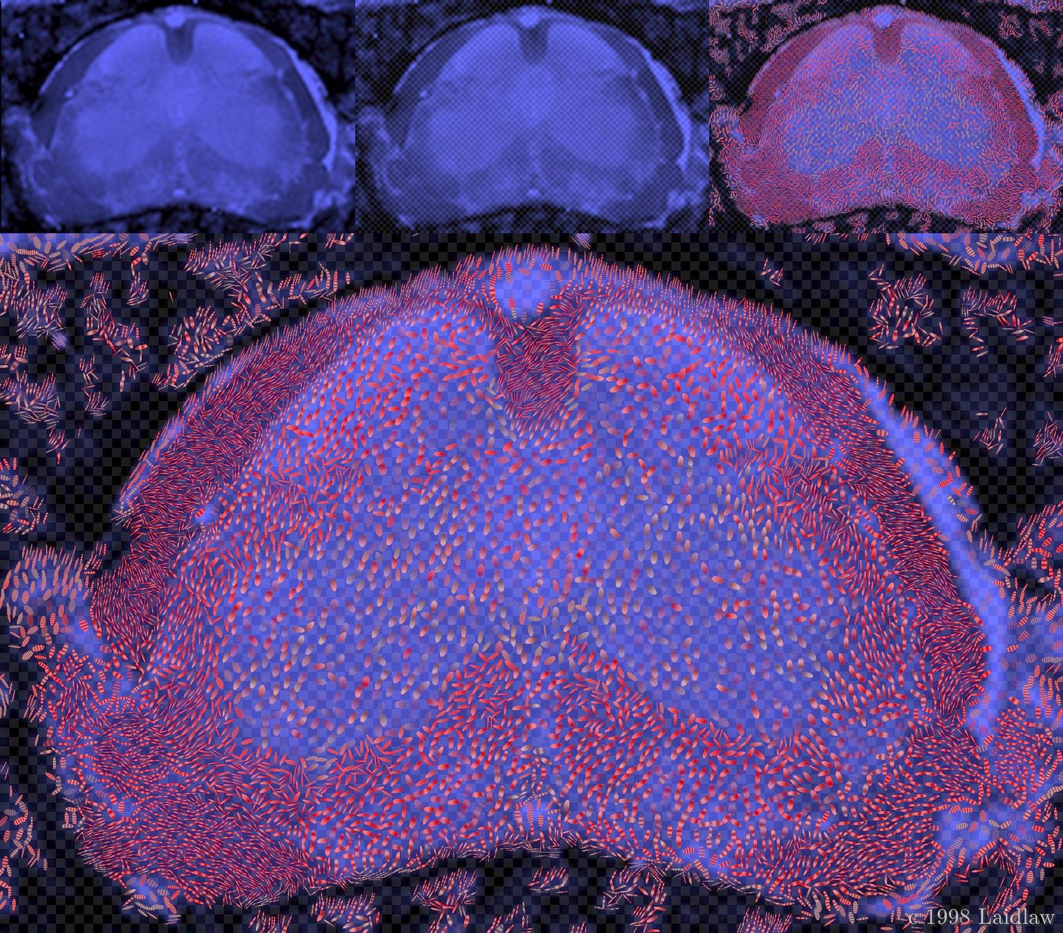
Moreover, given today’s computer technologies we can now build 3D fly-through visualizations. Doing this for complex relational information, such as scientific co-author networks, is especially promising. Most of the co-author network diagrams we see are actually 3D, which makes the 2D version that is usually shown very confusing.
I have experimented with this sort of thing, leading to what I regard as the funniest error message I have ever encountered. It said “the reason you cannot see this object is because it is behind you.”
Reblogged this on Kevin B. Gunn and commented:
“Three principles should inform your design: one, Who you are, what you have to say, and what you want to communicate, two, who is the reader; each reader comes with their own contexts, biases and assumptions and you have to account for that, and third, the data itself; what it has to say and how that informs the truth.” Julie Steele, O’Reilly Media