Science is based on a meritocratic model that rewards those who have made significant contributions to our understanding and application of human knowledge. When resources are limited and competition for funds and positions is high, we are drawn toward performance indicators in order to rank the field of contenders. Numbers provide a more objective basis of comparison, or so we are told.
For the last four decades, measuring the incorporation of a piece of research into the corpus of scientific literature–through the act of citation–had near monopoly status as a proxy for scientific impact. Indeed, the citation became reified as impact itself through indicators like the Impact Factor. Today, dozens of new services hover around the perimeters of science publishers, gathering, aggregating and selling access to new data sources on how individuals (not just scientific authors) interact with the literature.
What these new data sources mean is still up for debate. Proponents of alternative forms of evaluation often neglect answering the question of meaning directly and instead argue that alternative (or alt-) metrics enlarges the community of conversation, tells different stories, or that it is simply too early to tell. The fact that NISO has entered the debate in an attempt to standardize these new metrics is a signal that alt-metrics may not remain so alternative after all.
Whereas NISO may help standardize how things are counted and reported, they cannot help determine what these new metrics mean. Whether tweets, for example, measure popularity or prestige or simply the noise of narcissistic authors, bored academics, and automated bots will need to be decided by individual communities for specific functions: for instance, by a research university for the purposes of promotion and tenure; by a teaching hospital for the purposes of education; or by a government health department for the purposes of public engagement. For each of these groups, “impact” means something very different. A dogmatic approach toward interpreting the meaning of metrics for users is only going to meet with widespread criticism and resistance.
For this reason, new metrics services should focus entirely on aggregating and displaying information, rather than interpreting results to their users. While I don’t think that I’ll receive any resistance to this claim, the way a service constructs and displays indicators to their users can convey deep biases.
To start, the Journal Impact Factor, produced annually by Thomson-Reuters, is a measure of the average annual performance of articles published over a two-year window and reports the result to three decimal places (e.g. 1.753). The rationale behind the decision to report three decimal places was to avoid ties within a subject collection and to allow journals to be ranked from highest to lowest. Yet, as critics have often voiced, such an approach results in a false sense of its precision.
Similarly, the Faculty of 1000 article ranking service, F1000 Prime, calculates total scores for each article that received a rating and displays the result in a star badge. Since a F1000 reviewer can give an article one, two or three stars, a reader is unable to separate the quality of the ratings from the number of reviewers using just the score. This badge, given to an article published in the New England Journal of Medicine, was the result of six recommendations. One needs a subscription to F1000 Prime to view the individual ratings behind the badge.
Altmetric also provides a badge that displays the performance of an article based on variety of statistics that the company collects. Euan Adie, its founder, told me that the Altmetric ‘donut’ (or more specifically, a French cruller) was purposefully designed to avoid creating a false sense of precision. Different types of users can focus on different color components of the donut, for instance, a press officer could just focus on red, representing the number of news outlets. An editor may focus on yellow, representing science blogs.
In reality, most articles receive little (if any) attention in the wider community, leading to donuts with little color variation or no donut at all. While users can click on the donut and get details behind the graphic, the metric does fall into the same issue as calculating a total score. What is more worrisome is that the algorithm behind the badge weights indicators in a way that is non-transparent to users.
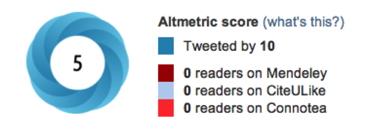
For example, this badge from a Scientific Reports article indicates that the paper was Tweeted by 10 but received an Altmetric score of just 5, suggesting that each tweet counted for just 0.5 Altmetric points. A couple of days later, the article accumulated 14 tweets and an Altmetric score of 9, suggesting that each tweet now counted for 0.64 points. The next day, 15 tweets equalled 10 Altmetrics points. The company’s description for how the Altmetric score is calculated reveals that their scoring algorithm is much more complex than just counting, weighting and summing the scores of each impact component:
So all else being equal each type of content will contribute a different base score to the article’s total. For example, a tweet may be worth 1 and a blog post 5. In practice these scores are usually modified by subsequent steps in the scoring algorithm.
I contacted Euan Adie for more details on their algorithm. He responded that each data source starts with a base score, which is then weighted based on the author of the mention. The weight of each author is based on three components: bias, promiscuity, and reach. For Twitter, bias is measured by how often an author tweets about the same journal or DOI prefix; promiscuity is measured by how often an author tweets about papers; and reach is measured by an author’s number of Twitter followers as well as how many of those authors also tweet about papers. Add this calculation to the construction of the other component indicators that go into the Altmetric score and the result is a very data and computationally intensive process.
An author skeptical of his score would need the complete dataset and algorithm from Altmetric to validate the result. This makes validation of index scores nearly impossible. In defense, Adie responded:
I do sometimes worry that emphasising the scores and algorithm to our users any more than we do is actually a bad thing. Perhaps if you’re ever at the point where you’re worrying about the exact weighting (rather than the general principles) of the algorithm then you’re doing it wrong and should be focusing more on the underlying conversations instead.
This argument, that the Altmetric score needs to be used wisely and not taken out of context, seems familiar to Eugene Garfield’s defense of the Journal Impact Factor. If the creators of an index are concerned that people will use it as a mechanism to rank articles, authors and journals, they should avoid calculating numerical scores and focus instead on the descriptive presentation of the data. For Altmetric, this means saving the donut but dropping the (jelly-filled) score.
I want to end with an index that was not designed to measure scientific impact but human well-being. Well-being is a multidimensional construct, like scientific impact, that can be measured in many different ways. Like scientific impact, well-being has been dominated for years by economic indicators, most notably, the Gross Domestic Product (GDP).
Recently, the OECD developed a Better Life Index for measuring the well-being across countries, something Toby Green, Head of Publishing, referred to as an alternative to the GDP (an “Alt-GDP!”). Using a flower model, each indicator is represented by a separate flower petal, with the height of the flower being its total index score. Yet, unlike the Altmetric score, the Better Life Index allows users to weight each indicator on a sliding scale, from least important to most important. Slide each topic dial and the graph adjusts to the new weighting: some petals get fatter, others thinner, and watch the lengths of the flowers adjust to their new values.
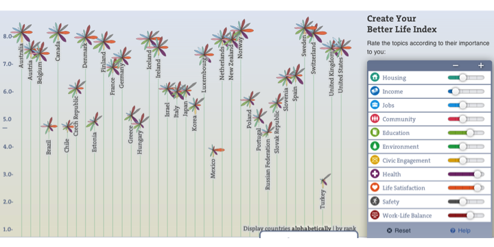
It’s not difficult to apply this model of index construction to the measurement of scientific impact. The Better Life Index allows for the aggregation of many different indicators of impact but reserves the weighting and ranking to the user. In this way, the Better Life Index avoids the dogmatism of other multidimensional indices, whose creators have predefined the value of each indicator.
In the next several years, we’re likely see competition for dominance in the publication impact industry. If we view the creation of an index as having two component parts –data aggregation and data visualization– there is room for multiple services to coexist within this space. Indeed, one company could focus on data aggregation (providing validity and reliability testing to ensure high-quality data) while others create various end-user tools to represent and allow manipulation of the data.
In sum, the strategy for alt-metrics should not be in developing authoritative indexes to compete with the prominence of citation-based metrics like the Impact Factor, but in aggregating and displaying reliable data. For multidimensional data, the authority in the system should be held, where it belongs, in the hands of the user.

Discussion
14 Thoughts on "Visualizing Article Performance — Altmetrics Searches for Appropriate Display"
Good stuff, Phil, a mess of metrics! The same thing is happening with journal metrics. See for example http://www.journalindicators.com/.
As an analyst I love the idea of tunable metrics, but most people probably do not want to master algorithms. They prefer lists or simple visualizations, in which case it comes down to whose metrics win the popularity contest. The good news is that the science of scientific communication will prosper in the process. People want to improve communication and we need data to do that, data which altmetrics provide.
Another place where altmetrics are important and tunable one’s potentially very useful is in policy analysis. I am just beginning to explore the regulatory impact of the OSTP mandate, in the context of discipline specific embargo periods. Many of the data needs point to altmetrics. Kinds of usage, and by whom, are much more important than citations.
Too bad the OA movement has killed revenue as a measure of success. There’s much to be said for that old capitalist standard.
Since we are talking about research author metrics, one major use is to help determine who gets the research revenue. I do not see that OA has seriously affected research revenue, much less killing it. Journal revenue may be a different issue, but even here it is more of a threat than a reality.
True, but often the best time to consider and analyze a threat is while it’s still a threat, rather than after it has become a reality. In my view, this certainly goes for the fiscal redirection that is threatened by the rise of Gold OA. Every dollar of APC built into a grant is a dollar that won’t go to support new research. I think the time to decide whether or not this is a big deal (and, if so, what to do about it) is now, before the threatened reality becomes a new status quo.
I was referring to journal revenue. If one has to plunk down money to see the articles, that is a good measure of value.
Clearly you haven’t seen this:
http://www.plos.org/about/what-is-plos/progress-updates/
Revenue is, without a doubt, seen as a measure of PLOS’ success.
The revenue for PLOS is all on the producer end (publication fees) and does not depend upon anyone valuing the content. Produce more content and you get more revenue. You can keep your producers happy by concocting all kinds of value measures, as this excellent article has shown.
This is exactly the opposite of a subscription service, where the measure of value is direct and the market can be brutal.
I agree — without an impossibly complex algorithm impact data can’t be aggregated into a single, context-independent indicator of value. The most likely scenario (imho) for an academic in the future will be picking key outputs and presenting them on a CV with (alt)metrics as characterising evidence — the start of a conversation rather than the end — requiring ‘raw’ numbers (perhaps scaled by a population average). A summary would just need to be unpacked again anyway.
Phil, thanks for an interesting article.
My personal feeling is that altmetrics are more complex, and there could be even more sub-division of tasks than you suggest. For example, when it comes to the collation of data, it is one thing to crawl for DOIs (and urls equivalents), it is another to use NLP to winnow out more naturalistic references. For example, referring to a surname as a shorthand for a previously mentioned DOI, or resolving a DOI from an article title plus the information that it was ‘recently’ published in journal X.
These would be less important, if it wasn’t that informal referencing often occurs in arena that have a higher social impact: in the mass media and governmental / quasi-governmental documents, for example. And, having captured softer references (Altmetric.com certainly go some of the way down this road), what do we do with comments associated with those stories, or tweets that discuss both the story and the comments?
It’s relatively easy to understand that there can be 3rd, 4th, 5th generational comments about scholarly impact, and whilst this may be of peripheral interest for someone attempting to predict ultimate citation counts or impact within the scholarly communication, these are vital for modelling social reach and attempting to compute social impact.
Our tools need to be constructed for the job in hand, and although I’d always advocate open algorithms in the centre of these tools, I don’t see that standards per se are necessarily going to be useful in the evolution of different commercial and non-commercial altmetric tools, platforms and strategies at the current time. Certainly, while discussions around standard methodologies, outlining research activities, approaching a common vocabularly, etc, would all be helpful, I don’t think that anyone is about to start proposing an altIF in the near future. I’m hopeful that the move towards these discussions will prevent any untoward rush towards an unproven metric.
Regarding the hermenutic endeavours in altmetrics that you touch upon, I feel that we have not yet appreciated the scale of the problem. I recently started a review of the literature regarding the motivations that lay behind the usual form of citation, and am impressed by the scale of the research. Even this relatively minor subfield of bibliometrics has many score papers going back several decades, with contributions from social psychologists, bibliometricians, computer scientists and other fields: there are a wealth of factors that lead people to cite, and immediate, public citation will surely be even more complex (one can readily think of half a dozen factors which will vary).
Social usage data hasn’t been around for very long, and it is not yet stable – new platforms continue to emerge while others pass into the great 404 in the sky (hello Pintrest, goodbye Connotea, I’m sure it’s only a matter of time before scholarly references appear on findery.com), and attitudes towards privacy will evolve over time. Any algorithm that permits a comparison of papers’ altmetric performance will have to be able to respond to over a dozen dynamic factors, and will be necessarily complex. But – I hasten to add – computable – even if it can’t ultimately take the form of a simple number, since some of those factors have to take into account “who wants to know, why do they want to know and when”.
For my part, I favour five easily identifiable, descriptive buckets to avoid the pitfalls of interpretation on meaning (are tweets post-read events? does adding to Mendeley indicate an intent to cite, or a recommenation to read?). These should be easy to define and understand:
* Social noise – tweets, facebook, pintrest, delicious, etc. Anyone can post, re-post, a trivial activity
* Scholarly activity – zotero, citeulike, mendeley, connotea, etc. Some form of intent to share and use by people using specialist commentary platforms
* Scholarly annotation – F1000, blogs (many more to come, inevitably) – where scholars have taken the time to review, to comment, to debate.
* Mass media – no explanation necessary
* Re-use – where data, figures, code has been reused.
(Disclaimer: Euan @ Altmetric.com is being very supportive in letting me explore his data and experiment with my classifications.)
I agree. We’re glad others are recognizing the value of visualization of altmetrics.
We have been working on this at Plum Analytics http://www.plumanalytics.com since January 2012.
We not only have article level visualizations but also author and group level.
I found Phil’s presentation very measured and a real help. It seems to me that NISO have moved in too quickly. At the recent Fiesole Retreat in Singapore there was a session on altmetrics. Jason Priem took a wide view and his presentation was not handed over to the organisers but some may find the presentation by Michael Mabe of interest – it is at http://www.casalini.it/retreat/retreat_2013.html.
Thanks for the shout-out, Anthony! Sorry, thought I submitted the presentation, but seems I was mistaken. At any rate, here it is now, despite being both too little and too late:
@Phil: nice post…rarely have we agreed so thoroughly. At ImpactStory, we’ve steadfastly resisted any unary number or statistic for the reasons you discuss.
That said, I think Euan is to be admired in many ways for taking a stab at this. Of course folks are going to disagree with the way the number is calculated. But in some ways this can be a positive thing, as it helps provoke and guide discussion about what we as a community (or more accurately, communities) find important.
What’s essential, though, is that the raw data behind the algorithms stays open and accessible, so that different folks can try their hands at processing the data in different ways. Our goal with ImpactStory is to grow into a source of this information, an impact data infrastructure that lots of folks can build visualization, recommendation, ranking, and other services on top of.