Forest plots are routinely used in the medical literature to compare the performances of different treatment groups or, in the case of meta-analysis, to summarize the results of many similar studies. I use them routinely to analyze the performances of research papers and give editors a sense of how each section of their journal is doing. For a journal that organizes its papers by type or topic, a forest plot can give a nice visual comparison.
The example below is a forest plot that summarizes the citation performances of original research articles published in a microbiology journal, by section, over the past five years. I’ve changed the names of the journal sections to characters for discretion.
In this graph, section performance is measured against the average performance of all papers published in the journal, such that zero represents average performance. Estimates for each section are represented by a circle, whose size is scaled proportionally to the number of papers within that section. The horizontal lines represent the 95% confidence interval for each estimate. Sections to the right of the dotted line perform better than average, while sections to the left perform worse than average. The colored estimates indicate those sections that perform statistically better (blue) or worse (red) than average.
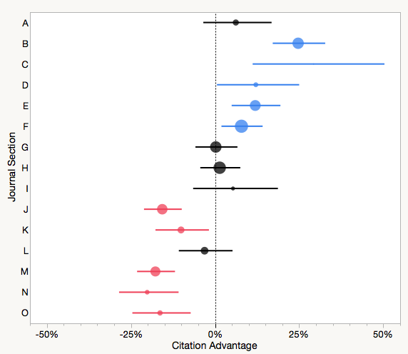
From this analysis, the editor was alerted that papers published in section B, C, D, E and F were performing significantly better than average, while sections J, K, M, N, and O were performing worse. As a result, the editor may decide to pursue more papers in the further group or make the later group more selective. Many society journals publish papers covering undergraduate education or public policy, and generally these papers do not perform nearly as well as original research articles. This does not mean that a journal should stop publishing these types of papers — it may be the mission of a society publication to do so — only that the editor and publications board should know how they effect the general performance of the journal.
For comparison sake, consider calculating simple arithmetic averages for each journal section, similar to how the journal Impact Factor (IF) is calculated. For our microbiology journal, Section A received the highest rank using the IF method, but placed just sixth out of 15 using regression–the tool I used to create the forest plot. Why the big difference?
Arithmetic (unweighted) averages are sensitive to outliers, meaning that a single highly-performing paper can greatly distort the average performance of a small section. Secondly, sections that grow (publish more papers) over time contain a cohort of younger papers–papers that tend to underperform compared to older cohorts. As we saw with the AAM Academy analysis, time can cofound citation comparisons. In our case, Section A was shrinking (publishing fewer papers) over the years, which tended to inflate its average performance. Controlling for the age of each paper and Section A performed no better than average.
I love forest plots because they reveal so much information in a single graph. By glancing at the first example, a reader can understand the effect size of each section along with its variance and significance. The graph is set up to compare multiple groups and includes a reference — in our case, average performance — although other references can be used. This single graph would require an entire multi-column table to present the same information and take a reader much longer to digest and interpret.
In publishing, forest plots can be used to compare how papers on the same topic perform across different journals, or different journals across different publishers. One journal editor wanted to compare the performances of its associate editors, in order to provide feedback on their selection abilities. Were associate editors able to identify and select high-performance papers? A little periodic feedback can go a long way.
Any continuous variable (citations, downloads, speed to decision) that can be grouped by a categorical variable (article type, topic, person, journal, publisher) is ripe for representation in a forest plot. Unfortunately, forest plots are not easy to construct using spreadsheet software, although they are common output types for statistical software.
Altmetrics have pushed journal publishers toward a myopic view of performance, focusing on individual trees (papers), while ignoring the forest (journal), ecosystem (publisher) and biome (publishing environment). Forest plots are powerful tools that provide us with broader, farsighted views of performance.
This autumn, go for a walk and enjoy the forest for the trees.

Discussion
6 Thoughts on "Seeing the Forest (Plot) for the Trees"
You might enjoy this article on visual presentation of scientific results: Seeing is believing: good graphic design principles for medical research. Statistics in Medicine http://dx.doi.org/10.1002/sim.6549
This is very useful, thank you for sharing!
Is the idea to get every section lined up on the average? I am curious about the rationale for that?
Also, the concept of confidence intervals comes from sampling theory. Are these samples or full population measurements, in which case we are talking about variance, not confidence. Why do you call them estimates?
The rationale for using average performance as a reference is to identify sections that may be doing better/worse than average. You are correct about sampling theory. We make the assumption that a cohort of observed papers in each section represents a sample from the larger population of journal articles. For the purposes of the analysis, this assumption works. One could alternatively just plot the data as a scatter plot, box plot, or violin plot.
Hi Phil, great post! I’m intrigued by your closing statement. Wouldn’t it be fairer to say *article-level* metrics are encouraging a myopic view, rather than altmetrics per se? Shouldn’t we be equally interested or able to undertake tree- / forest- / ecosystem- / biome-level analysis based on altmetrics (or individual altmetric sources) as on citations?
Yes, I do think it would be fairer to make the statement about article-level metrics encouraging a myopic view, but the statement becomes somewhat of a tautology. Altmetrics are almost entirely focused on article-level assessment, and indeed, those promoting altmetrics routinely take positions (or write manifestos) against journal-level metrics, like the Impact Factor, as justification.