As families throughout the UK settled in for an evening of scary movies and calories this Halloween, we were interrupted by a new and far more horrifying tradition — the televised government COVID briefing. Here in Edinburgh, our family had a merciful sense of distance, because many of the aspects of the fight against the virus are devolved, meaning that the restrictions to be announced would apply only in England. Scotland, along with Wales and Northern Ireland, have their own rules.
What bothered me about this particular press conference was the quality of the presentation. A lot has already been written about how Boris Johnson’s government is handling things, look here, here and here for examples. Ministers have been accused many times of not ‘following the science’, so perhaps in an attempt to counter such criticism, Johnson handed the briefing over to Chief Medical Officer, Chris Witty and Chief Scientific Advisor, Sir Patrick Vallance to ‘present the latest data’.
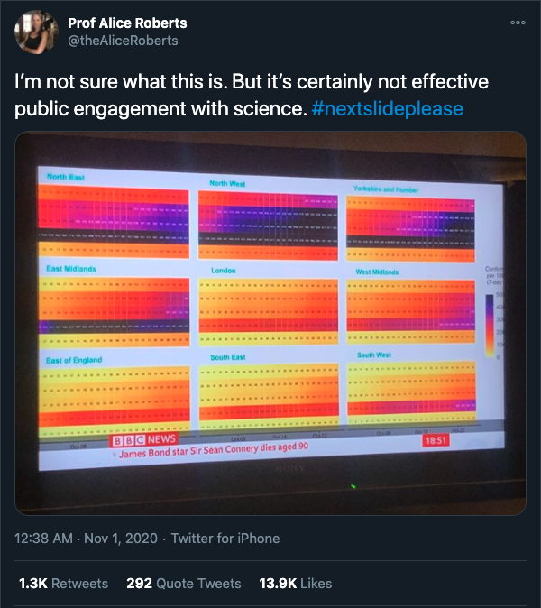
Unfortunately, the Powerpoint slides that the UK government presented to us on Saturday, which we can only assume were intended to demonstrate their understanding of ‘the science’ were messy, overly complicated, disjointed, and confusing. Professor Alice Roberts of the University of Birmingham, among others called out this particular egregious example.

So, why am I writing about this? If the government’s Powerpoint game is weak, what does it matter? They’re not in power to make pretty graphs, they’re there to make decisions, right?
Well, no. It does matter; in fact, it matters a lot. There’s a lesson here for any organization that doesn’t take the time to properly process and understand the information that they have available before sharing it publicly. The real problem isn’t that the slides were poorly laid out and the axes were often missing. The biggest crime isn’t even that the text was too small to read, or frequently ran off the edge of the screen. The problem is that nobody had taken the time to understand all the different sources of data and synthesize them into a coherent story.
The art and science of data storytelling
We all know that telling stories is a powerful way to convey ideas. We’ve been doing it as a species ever since we developed language. Stories, particularly stories about people, are interesting to us. We connect with them emotionally and, whether it’s joy, love, surprise, anger, or sadness, there are deeply wired survival mechanisms in our brains that tell us that we should remember the things that make an emotional impression on us.
Data, on the other hand, has a reputation for being a bit boring because it’s about numbers, not people. It’s an ill-deserved reputation, however, because often, underlying all those numbers are real human stories. For instance, watch this data storytelling / standup comedy hybrid TED talk by Ben Wellington about what cycling accidents, parking tickets and subway fares can tell you about the cultural idiosyncrasies of New York City.
Sometimes, a lack of clarity or narrative can have serious consequences. An example from history was the disastrous decision to proceed with the launch of the Challenger space shuttle shuttle in 1986. In his book, Visual Representations, Edward Tufte makes the case that if data about O-ring damage caused by temperature changes had been presented graphically and in context, the launch would not have happened and seven lives would have been saved. This blog post shows both the slide that was presented as well as Tufte’s visualisation, the difference in clarity is striking.
The case of COVID data is certainly no less serious. There are many lives at stake; people, loved ones, communities, all affected by the pandemic. There is a complex series of risks to balance from the physical risk associated with the virus itself to the economic, mental health and other risks like increased domestic violence, posed by lockdowns and restrictions. If the government wanted to get us all on side with the new restrictions — as we need to be for them to work — all they had to do was take us through the journey of what those numbers mean about the lives of real people.
Take this data journalism piece from The New York Times, for example. Their animated data story manages to take us through how the US administration claimed to be handling the COVID outbreak and juxtaposes it against what was really happening, based on tens of thousands of data points. By combining context with visualization, and drawing out individual representative examples, Derek Watkins and colleagues guide us, the audience, through a complex emotional journey and deepen our understanding of what happened.
When Sir Patrick Vallance embarrassingly tried to pass the blame for his poor communication by saying, ‘this is a complicated slide, it’s from the NHS’, it was clear to me that he hadn’t been briefed well enough to know why that particular slide was in that particular place in the deck. In other words, there was no story, no context; it was just a bunch of numbers on a series of poorly laid out Powerpoint slides.
A lesson for all organizations
Good visualization is key to making sense of data. By understanding the grammar of graphics, we can learn how to encode data visually to make it both aesthetic and meaningful. If we want to go further than that and make meaningful decisions on the basis of our data, we must understand its context and that means telling stories about it.
So remember, if, when data is presented at — or by — your organization, it’s boring and hard to follow, if the stories that lie behind the numbers aren’t drawn out to make them meaningful and interesting, then nobody will understand the context or care about the data. And, if that’s the case then, like the UK government, your organization is likely to make poor decisions; and your stakeholders are likely to be as disengaged and dismissive of your data as the British public was of their government’s this Halloween.
If you haven’t had the pleasure and would like to see the original slides from the briefing, they’re available here, they’re in slightly better shape than when they were presented live, but not by much.
Thanks to fellow Chef, Alice Meadows for help editing this post.
Discussion
13 Thoughts on "What a Mangled Press Conference on COVID Can Tell Us About the Need for Good Data Storytelling"
Since you mention Edward Tufte above, I want to re-emphasize how important his works are, and how valuable they can be to anyone working with data, information visualization, and design in general. Back in my scientist days, we considered his books required reading for anyone hoping to effectively communicate their research results. I wrote about this in The Kitchen back in 2018:
https://scholarlykitchen.sspnet.org/2018/12/20/ask-chefs-book-lasting-impact/
And the good news is that he has a new volume due out shortly, yet another cause for celebration in what seems to be a brighter end to 2020 in many ways:
https://www.edwardtufte.com/tufte/seeing-with-fresh-eyes
It seems that you’re not the only Tufte fan based on the other comments. Perhaps one for the Kitchen bookshelf.
I’m a huge fan of the grammar of graphics approach espoused by Leland Wilkinson. Here’s a blog post about it:
https://towardsdatascience.com/a-comprehensive-guide-to-the-grammar-of-graphics-for-effective-visualization-of-multi-dimensional-1f92b4ed4149
The approach was built on by Hadley Wickham who wrote it into the structure of how the ggplot library works in R, which makes it really easy to translate theory into practice.
I’m a huge Tufte fan.
For even more on how PowerPoint kills astronauts, see his blog here: https://www.edwardtufte.com/bboard/q-and-a-fetch-msg?msg_id=0001yB
Phill’s position on the Advisory Board of Researcher to Reader precluded him, no doubt, from mentioning how important data visualisation is to us at R2R, as this item might confirm.
https://r2rconf.com/2020/03/26/r2r-even-more-relevant-valuable/
Thanks Phil,
An important and under-appreciated topic – well illustrated with compelling examples of good and bad. Reminds me of a discussion on lack of training for faculty and scientist in how to do great (online) teaching and the lack of training offered by universities to their faculty on instructional design, storytelling and communication. Why do we expect scientists to be good at communicating without training or advice?
Thank Niels,
You make a really good point. There’s a broader question here as well about what skills we expect researchers to have and how they’re incentivised (or not) to develop and/or teach those skills.
There’s a really interesting position paper from a number of Dutch research organisations (VSNU, NFU, KNAW, NWO and ZonMw) that talks about how academia needs to do a better job of incentivising a range of skills.
https://www.vsnu.nl/recognitionandrewards/wp-content/uploads/2019/11/Position-paper-Room-for-everyone%E2%80%99s-talent.pdf
Tufte’s “Quantitative Display of Visual Information” was my bible for educating young doctors in the art of presentation. I used to do a presentation of my own with a colleague, which we called “How Not To Do It” and included all the presentation errors we could think of – which included all of those in this infamous press briefing.
However there is a far more fundamental problem than just poor display. Several slides contained selected data that fitted the hypothesis; one purporting to show a continuing and exponential rise in numbers actually showed in most graphs (this was one of the busy slides) that there was actually a levelling-off of numbers; the prophecies of doom were based on out-of-date data; and it would appear no-one had reviewed the presentation to ensure factual accuracy. In medical science we expect important material to appear only after it has been peer-reviewed, and in this case post-hoc peer review has effectively undermined if not destroyed the conclusions. As a large number of British businesses will go to the wall because of the second lockdown, and as this was based on the flawed and alarmist projection, the failures are egregious if not criminal.
Thanks Andrew,
For those that might not be keeping up with the latest in UK based COVID mismanagement, there’s a story on BBC news below about the factual error in the presentation.
https://www.bbc.co.uk/news/uk-politics-54839359
In my piece, I didn’t take a view on whether the lockdown is a good idea or not. I personally don’t think it’s as simple as that. What I will say, is that it would be a second mistake to assume that the recommendations around restrictions to control the virus are necessarily wrong on the basis that some of the data was wrong.
I agree that the government is doing a poor job of taking on scientific advice and did a spectacularly poor job of justifying its decisions with data, irrespective of errors in the data they presented.
An interesting piece Phill. I’m also a Tufte fan and it’s good to see so many others are too! Interesting to discover he has a new book coming out too. In addition to Tufte, I’m a fan of Stephen Few’s Show me the numbers:
https://www.amazon.co.uk/SHOW-ME-NUMBERS-STEPHEN-FEW-dp-0970601972/dp/0970601972/ref=dp_ob_title_bk
Also Andy Kirk and Alberto Cairo’s books.
“Dataviz literacy” is certainly inportant and an area where more training could be provided (we deliver sessions to PhDs on creating figures and good data visualisation and it is popular). A challenge is that people have different level of experience in this area and have rarely been taught how to do it.
Hi Jo,
Thanks, that’s another good book recommendation. Every year, the Kitchen has a best books we’ve read post at Thanksgiving. It seems like we’re getting a head start on that one.
You’re right that data viz is not well taught. I remember as a grad student lots of times students and researchers visualisations being criticised for not being clear but I was never told what actually makes a good visualisation.
Sounds good – I’ll look out for that best books post.


