In its simplest distillation, the job of the author in scholarly communications is to conduct research and then communicate their results to the community. Of course, this does not capture all of the elements of that process. Nor does it capture all of the work for those who also engage in the process of getting those ideas from the author to the community. Most authors don’t consider much the work that gets a manuscript from an original document file into something that gets into the hands of a user. For centuries this made perfect sense; the responsibility of the author was to write and the responsibility of the publisher was to publish (and all that entailed). As the landscape of distributing content changes, some of these responsibilities are shifting and there are important reasons for authors to embrace their new role if they choose to forego traditional publishing.
There’s a string of Scholarly Kitchen posts about the value-added elements of the process that publishers — and the support organizations in our community — provide. Many have argued, promoted in large part by those who don’t see the rationale for a role of publishers in this process, that publishing is simply a fancier — and costlier — version of posting a file to the web. Whatever your opinion about the business model of publishers, effectively sharing your results requires that you, as an author, have some understanding of how content is communicated via text, and particularly digital text. Increasingly, as authors become ever more independent of the traditional publishing ecosystem, it is vital that they start to learn how and why they should use some of the more advanced tools in their word processors.
Let’s first start with the idea of text as a representation of an idea. People have long used typefaces and capitalization to convey meaning. If I write IN ALL CAPS IT OFTEN UNDERSTOOD AS A SIGNAL I’M SCREAMING AT YOU. This is also used in legal documents as a signal of important clauses in a contract (there’s a connection here I’m sure!). Traditionally, if you’re writing in Latin a species name, a gray wolf for example, one would italicize the name and capitalize the genus name as in Canis lupus. One might bold face an important clause in a sentence to catch people’s eyes to important details, such as dates or times. People often also underline things for emphasis. Titles, headings, quotes and various other elements of a document are given different fonts, sizes or styles to convey consistent meanings to the reader.
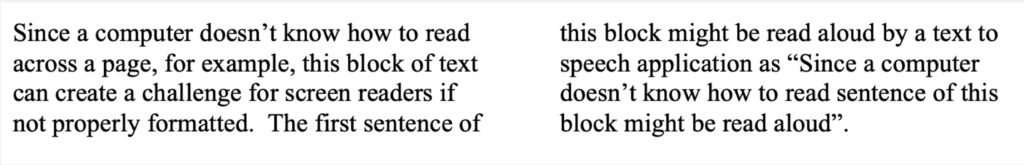
There is an important difference between how these things are represented, stored, and the meaning that those things imply in digital documents. Each letter your write using your Microsoft Word software, Google Docs, or in your WordPress platform, is stored as ASCII characters in a hexadecimal code (a shorthand version of the binary ones and zeros that a computer actually understands). Behind the display as you read or write, the computer ‘sees’ the letter “T” as “54” and the lower case “t” as “74” (and without confusing readers too much, that isn’t technically “fifty four” or “seventy four” as understood in the base-ten decimal system, but that isn’t necessary in this context). The representation of the typeface and whether it is bold, italic, or underline, is actually another layer above the characters stored by the computer. The computer reads “54” and a separate notation that the letter, word or paragraph should be displayed in bold or italics and in whatever appropriate font. This distinction is why it might be cute to represent my name as ↑Ø∂∂ using special characters, but this creates significant headaches for those that use text-to-speech screen readers, as brilliantly exemplified by Kent Dodds.
A 2019 study published in PLOS ONE found that authors spend, on average 14 hours formatting a manuscript. Elsevier’s Research and Academic Relations department found that one third of researchers indicated “preparing manuscripts” was the activity identified as “most frustrating or time-consuming”, in a survey conducted in 2012. This is nothing new. Nature publishes a regular string of Correspondences from scientists complaining about publisher formatting issues. When word processors were moderately new in the early 1980s, there was a study that found authors spent 50% of their time formatting and editing rather than writing their content. Formatting citations, for example, is another particular waste of authors’ time in my opinion, as I wrote back in 2014. However, it’s important to realize that when it comes to content formatting, this is something that most publisher will strip and replace with their own. This certainly doesn’t apply to things like links, citations, images, or the alt-text I described below. In part, this is because most authors confuse format with a style.
Publishers usually remove appearance formatting because it is simply tied to appearance, while styles have more to do with structure and semantics rather than the appearance of the text. An author can use the “italics” button to make something look like a quote because it’s in italics, but that is different from a style, which imparts meaning. Tagging things as a header, a footnote, a reference, or a quote, is not a signal that this thing should look a particular way, although it can be used to give those elements a particular visual appearance. More importantly, it simply is a structural signal that this thing is a reference and therefore should be treated in a certain way, which is different than body text. Describing things as an abstract, a protocol, or a reference indicate to systems that things should be displayed in a particular way, but also how it can be extracted, or how it should be structured and what kinds of information it should include. A style can allow the appearance to change easily based on output, such as print format, HTML website, a PDF, or a mobile reading experience. It can also allow for automation of things like tables of contents (built from headers), open citation lists extracted from the reference section that can be posted onto different sites, or abstracts that can be sent to indexers. Structured content can also facilitate machine reading and concept extraction, say if chemical or genes are linked via persistent identifiers.
Why is this important? Let’s start with the fact that not every human can experience reading through the visual representation of content. As agreed in the Marrakesh Treaty, a WIPO agreement carving out accessibility exemptions to copyright for the benefit of the blind, visually impaired and otherwise print-disabled people, every person has:
“the freedom to seek, receive and impart information and ideas of all kinds on an equal basis with others, including through all forms of communication of their choice.”
Authors have a moral obligation to facilitate that access and they have an important role in the creation and distribution processes. A publisher have a legal obligation in this regard. An author can pass this responsibility to the publisher, or if she wants to act as a publisher that responsibility remains with her.
Accessibility of content can be considered interoperability of the senses and how digital systems transform content from one medium to another. Here are some examples of how that works for digital content.
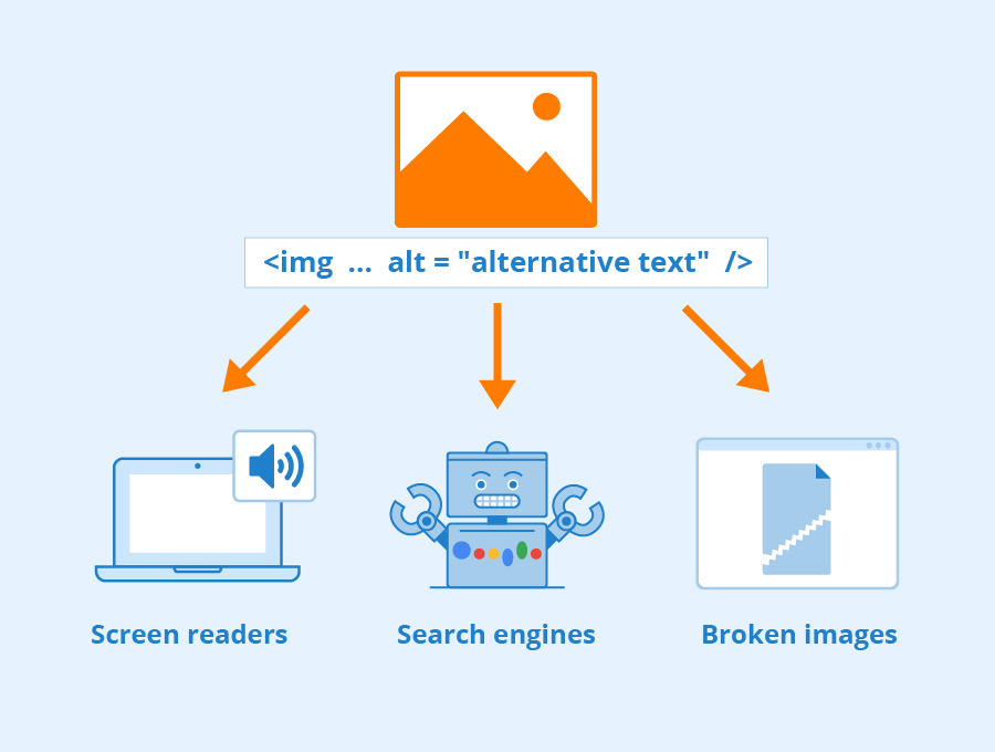
Similarly, images are particularly difficult for visually-impaired or print-disabled people to understand. The majority of people not visually impaired would be able to look at the following chart and grasp its meaning.
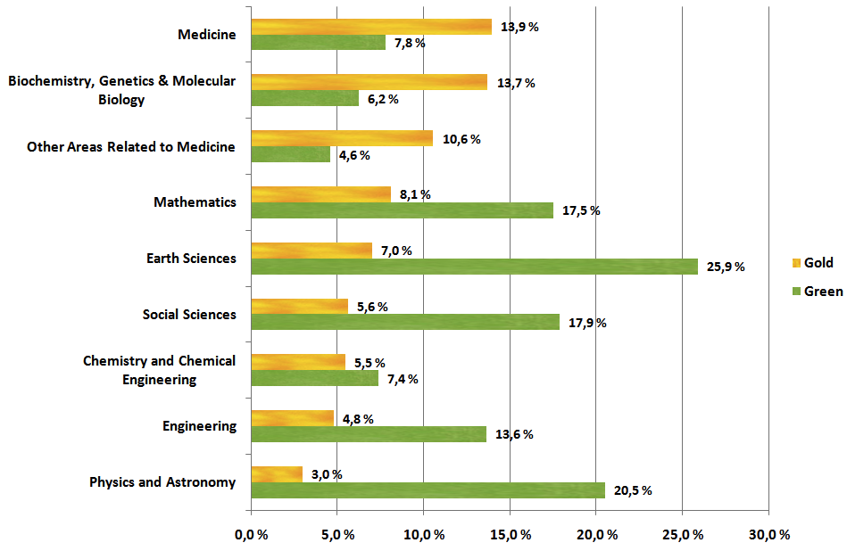
Setting aside that the chart lacks some valuable information for sighted readers, such as a title, a date, the percentage of what the definition of “Gold” or “Green” is, or the use of commas as decimal markers, the chart is probably understandable for the readers of The Scholarly Kitchen. But for someone who is visually impaired it is a useless waste of space unless the author has added information about the image. In the terminology of markup, this is called alt-text. Although the alt-text isn’t displayed to the user, it is stored in the background with the image. In this case the alt-text reads:
“A bar chart showing the availability of gold and green OA articles by scientific discipline. The disciplines are shown by the gold ratio in descending order, rather than in alphabetical order with the following disciplines shown (in order) Medicine (13.9%), Biochemistry, Other Areas, Mathematics, Earth Sciences, Social Sciences, Chemistry, Engineering, Physics (3%). Earth Sciences has the highest percentage of Green OA journals (25.9%) followed by Physics (20.5%) to a lowest level of 4.6% in Other Areas related to Medicine. It is used as an example of quality alt-text.”
It should be noted this isn’t the description provided in the Wikimedia Commons page of this image. I’ve expanded it. Good alt-text should not simply describe the image, such as “This is a bar chart”, but it should also include what is presented and why. Quality alt-text helps the reader understand what the image displays, what it conveys, and ideally also why it is included. Good alt-text should be more than the automated generated text that might be auto generated for you (if you bother to check it in Microsoft Word Alt Text panel), which might say “a bar chart” or “a cartoon” or simply “a graphical image”. None of these would be useful to someone who can’t actually see the image referenced in an article.
Similarly, there are ways to embed other information in the document. This might be about people involved in a project (say with their ORCID), or the chemicals (using identifiers like ChemID), or protocols used in an experiment (such as the DOI from a protocol repository like protocols.io or protocolexchange), or even the usage rights associated with the copy of the file that you’ve downloaded from a publisher’s site through access provided by your library (using the Article Sharing Framework). Much like a citation uses a DOI to persistently identify the cited article, many other elements of the scholarly ecosystem can be identified and linked using persistent identifiers. Other Scholarly Kitchen Chefs have described the value of persistent identifiers (another example, another example, and another example), so I won’t try to further sell you on their value.
As an author, think of using these persistent IDs much like you would use a reference, by linking (most word processors use the key-stroke Command +K to insert a link) so that you can embed the identifier to the referenced terms, usually as a hyperlink. Many publishers use automated systems to enrich content in this way, but authors are far better positioned to ensure that this is the exact protocol/chemical/concept/person you are referring to. Automated systems are increasingly precise at this type of enrichment, but I doubt any author would prefer an AI over their own knowledge of the subject matter. While entity extraction and tagging is something machines can handle, correctly describing an image is a ways off.
Particularly, as more content is being published directly to the web or in institutional or subject-based repositories, where files normally don’t go through a traditional publishing production process that inserts these structures, authors need to assume responsibility for making their content accessible and machine-interoperable. The entire ecosystem of scholarly communications would be better off if authors knew how to do this and understood why it can be important.
Note: If you would like to hear more detailed descriptions of some of these challenges faced by those in the production side of the publishing process, I strongly suggest you listen to some of the talks given earlier this spring during the 2022 JATS-Con Conference, hosted by the National Library of Medicine. In particular, a talk given by Joni Dames, Senior Solution Architect at Inera, an Atypon Company, about tagging for accessibility is particularly worth reading or watching.

Discussion
2 Thoughts on "#ProTip for Authors: There’s More to Writing Your Manuscript Than Just the Text"
Thanks for this, Todd, it is really helpful. I particularly like how you contrast current trends in online publishing with traditional publishing, that really underscores the fact that traditional scholarly publishing works hard to make sure content is structured to enable access and inter-permeability.
One thing I would like to hear you talk more on is the “carrots”, or incentives, for authors. Why should they do more to make their content more accessible and extractable? Why would they be better off, as you conclude, if they did this? When I have talked about this with folks, they see it as a lot of bother.
This is good to have the discussion but unfortunately the ALT example is not best advice for dealing with describing graphs.
First, the graph description is too long for ALT text. They cannot be searched or easily navigated. The screen reader treats ALT text as a single bit of text not a paragraph with structure. It should be part of the text (perhaps in a caption) because other people can benefit from this other than screen reader users. The image should then be marked as decorative.
Second, the ALT text describes visual aspects of the graph that are irrelevant to the screen reader user. ALT stands for ‘text alternative’ NOT for a description. For instance, “The disciplines are shown by the gold ratio in descending order, rather than in alphabetical order” is unnecessary. Ideally, it should be presented as a structured list or a table that is prefaced by ‘in descending order’. Lists should always be marked as such for screen readers – they’re easy to jump and down and the screen reader announces how many items there are. The final sentence is very good, though. But it might already be in the text somewhere near and there’s no need to repeat it.