Geoffrey Bilder of CrossRef has a classic illustration showing the outline of a piece of paper with black lines cutting horizontally across it in a recognizable fashion. You know immediately — from the thick lines centered nicely toward the top to the two columns of thinner lines with a section in the northwest corner that has a clearer structure — that you’re looking at a scholarly article, with title, abstract, and a classic two-column layout.

Scholarly articles are further structured, with methods, results, and discussion sections providing a template for presenting scientific and scholarly findings.
Printed scholarly materials evolved these structures as a way to make reported scientific information more and more comparable as time passed. Yet, in the more engineered world of online journals, finding common interfaces for researchers remains a challenge, which in some ways may explain the constant craving for aggregated and common interfaces, whether it’s Google or Google Scholar for search, Ovid or PubMed Central or Sci-Hub for papers, or PDFs and their inherently standardized layouts for reading.
Editors and publishers often want to design pretty sites, but not especially usable sites. Some aesthetic choices can end up cast under the rubric of “usability” while diverging from what users expect. Many journals are design and technology islands, quirky and idiosyncratic, sometimes beloved for it. But dealing with divergent layouts, systems, and presentations creates what experts call “cognitive load,” a burden on thought that only impedes information flow and retention. Users dealing with highly complex information are likely less tolerant of cognitive burden around the information they want, which may partially explain the popularity of the PDF and the persistent appeal of simpler sites and interfaces.
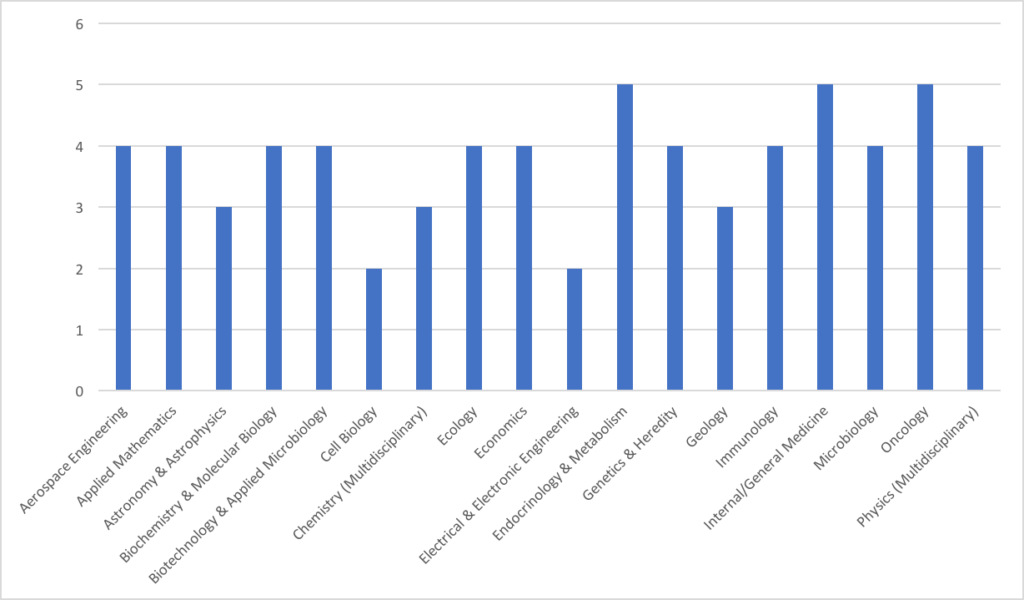
Recently, during the course of business, I asked DeltaThink to review top journals (by impact factor, for convenience and a modicum of significance — take with an appropriate grain of salt) in 18 different scientific fields (Aerospace Engineering, Applied Mathematics, Astrophysics and Astronomy, Biochemistry, Biotechnology, Cell Biology, Chemistry, Ecology, Economics and Econometrics, Electrical and Electric Engineering, Endocrinology, Genetics, Geology, Immunology, Internal Medicine, Microbiology, Oncology, and Physics), and identify which commercial publishing platforms they’re on (e.g., HighWire, Atypon, ScienceDirect, self-hosted, etc.). Here are the high-level results for these 90 journals:
- In two fields, each of the top five journals is on a different platform.
- In seven fields, the top five journals are spread across four different platforms.
- In seven fields, the top five journals are hosted three different platforms.
- In two fields, the top five journals are on two different platforms.
- In no field are all top five journals on the same platform.
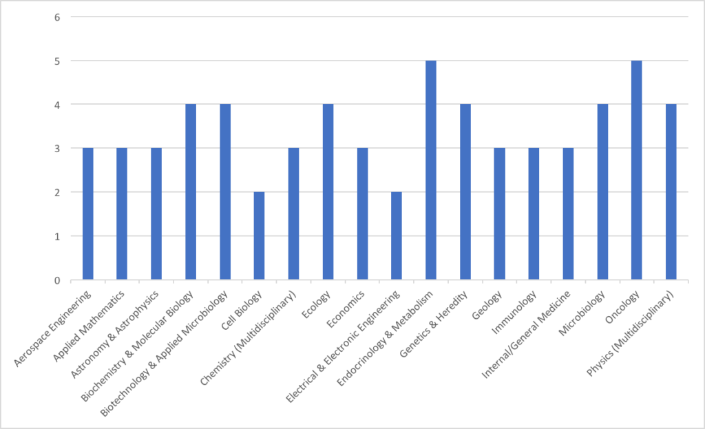
Most of the top journals in one field (electrical engineering) come from the same organization (IEEE), making this one of the fields with only two platforms supporting the top five journals. The other field with two platforms supporting the top five journals is cell biology, which is dominated by Cell Press and Nature.
There are many consequences for researchers navigating these divergent systems, including the chores of having to parse different designs, different logins, different technical demands (e.g., this site’s passwords require swear characters [#$!*&@] while this one requires 12 characters), and different features and feature deployments.
There are many consequences for researchers navigating these divergent systems.
New third-party systems like Altmetric, eLife Lens, ReadCube, Remarq, and others can provide a layer of common functionality or a standard interface across a set of journals. But even these are deployed unpredictably and without uniformity from the user perspective — I may see the Altmetric flower small, large, in a tab, or elsewhere, and so forth. I may use Lens on one journal, then a Lens-like design on another, and something completely divergent on the third.
All in all, it’s a confusing landscape for users.
Researchers sometimes try to eliminate these divergent interfaces themselves, with private PDF archives, reference manager software, and the like. Services like Mendeley once provided a virtual PDF locker for users, and now ResearchGate and Academia.edu are striving to provide a similar solution. The lure of UX consolidation remains strong enough to be interesting.
All this diversity in approach may be driving users toward consolidated experiences. While Sci-Hub is piracy on steroids, a single search and retrieval engine meets some core user needs. However, users are strange creatures, and aggregators of all sorts usually come up short of market domination, even if their services are perceived as free. At many institutions, librarians find themselves purchasing EBSCO and ProQuest and Ovid and the source journal because users develop preferences they won’t surrender, and the traffic still justifies the expense.
Even consolidation is fragmented.
Platforms are only the start of design, feature sets, system integrations, and various decisions publishers and technologists make. Even on a platform, journal instances can diverge. There are many different publishers involved in each field, as well (chart), each with their own strategic imperatives, design assertions, and system footprints. Perhaps we are still in the nascent age of digital publishing, and designs have not yet settled around a common set of interface standards and user expectations. Perhaps online is simply more dynamic and hard to tame, as the hardware, interfaces, and broader digital ecosystem all keep pushing publishers and designers to redefine themselves.
A higher degree of uniformity could be achieved in a number of ways. We have standardization all around us, from advertising standards from the IAB to technology standards. Visual standards are slowly evolving, but we could accelerate this by harmonizing the efforts. Interfaces matter, and a trade group devoted to defining the optimal layout principles and even a set of templates could help our users.
Perhaps we can forge a better path following the spirit of Geoff Bilder’s illustration, mentioned at the outset. Perhaps our sites could be as uniform and predictable as the papers we publish, with similar layouts, functionality, and standards — similar enough that scholarly sites become distinctive in and of themselves as scholarly in design and feature sets. We have long competed not on fancy layouts but on quality, relevance, and authority. Given where the real competitive advantages may exist, and the potential to improve usability while also reducing the risk of alienating users, more predictable sites with harmonizing features may only help.
Or, put another way, what would be the downside?

Discussion
13 Thoughts on "Platform Diving — Top Journals, UX, and the Lure of Harmonization"
Kent, Very interesting data – thank you for sharing them. I don’t doubt that more harmonization of the user experience across content platforms would be an improvement. But I wonder about the forces that have pulled us in the opposite direction, with a number of major content providers choosing in recent years to build or control their own platform infrastructure. It seems to me there is more, not less, competition for features and tools beyond content itself – indeed increasingly well beyond publishing. Isn’t this naturally pulling us further away from a harmonized user experience? I’m curious if you agree with this and if so what you make of it.
Hi Roger. I’m going to stick with scholarly publishing for my reply, even though I do think one factor in our search for the next big thing is our internalization of exogenous and somewhat irrelevant trends. As I’ve argued before (in a post that eerily foreshadowed some of the value of Sci-Hub), what users want and what we think is cool are often two different things. For instance, acceptance that the PDF is king has led to quicker navigation to the PDF from contents listings and so forth. This was admittedly not cool, but users prefer it.
The problem I’ve seen is multi-factorial. I think there has been an attitude that content is a commodity, when it is not a commodity from the users’ perspective. This leads some people to argue that services and design are the differentiators, when in fact the distinctiveness of the articles published in this industry and the brands they’re published under are so riveting that some claim each article to be a monopoly.
Internal politics also play a role. I think there are style points to be gained internally at organizations and platforms for making untestable claims about the benefits of self-hosting, complex passwords, snazzy designs, and so forth. Most of these turn out to amount to nothing more than a hill of beans, yet undoing these divergences takes years, as the implementations often go unmeasured once they are introduced because everyone’s so exhausted by the work.
I think we are hunting for the future in a heuristic and disorganized way, which naturally leads to dispersed efforts. There would be a lot of efficiency gained from an industry group gathering together to create a design template and technical specification for online publications — it would not only serve users, but platforms and publishers would have a set of standard interfaces and functionalities to work from, and build upon. Remaining visually and functionally fragmented is an invitation for disruption, as users seek interfaces and technologies that don’t take as much work in aggregate to navigate.
Thank you for this post. As someone who does research and uses these platforms I couldn’t agree more that this is a real problem, both on the submission/review side and for attempting to locate and download research articles. Having some standardization across journal management systems would be very welcomed. There are many systems in uses and their interfaces are all different. Sometimes it almost feels like publishers are having a contest to see who can design worst one possible.
I don’t condone Sci-Hub but it is easy to see why John Bohannon found that so many researchers with decent access to the literature through their libraries use Sci-Hub. A few days ago after going through my library electronic journal portal spending about 15 minutes and having to use a second browser (I couldn’t get the publisher’s system to download the PDF through Chrome), I decided to try Sci-Hub just to see if it had the article and what would it take to download it. It took one Google search to locate the link to Sci-Hub. I dropped the title of the article into the search box and before I could blink a copy of the article was on my desktop.
Just speaking for myself though I think most researcher will agree, that is want we want!! You shouldn’t have to wind your way through a complex system first finding the journal, then volume, then often the issue and finally the article then figuring out where on the page you can download a copy. And YES, most or at least many of us just want the PDF w/o any bells and whistles. As you note they are set up in a format that has been developed over years to be easily to read and generally that is all we want to do, read them and get the citation information.
If Sci-Hub abet illegally can do this why can’t publishers? We want to get the articles we need quickly and efficiently as possible. It is hard and time consuming enough to do research without wasting so much time getting articles that should in theory be a click away. That is the beauty and one of the most valuable aspects of OA that never seems to be mentioned. An article is only one click away. If publishers believe subscriptions are a better way to fund publication at least make it easier to access the literature once a potential reader has been authenticated as having access. Otherwise a large number of researchers even with access to the literature are going to continue using Sci-Hub.
Thank you, Kent (and DeltaThink!), for sharing these findings and your analysis. You’ve illuminated the natural tensions at play in our industry so well, as always.
As someone who wears both the publisher and the researcher hat, I can feel those tensions and see the conflicting motivations coming from both sides of the table. I think Roger Shonfeld’s comments are pointing to the heart of why prevents publishers can’t provide academic readers with a single aggregated platform, as David Solomon questions above. The information needs and practices of publishers are rarely aligned with those of authors / readers, however, they are competing over the same content. The research article is a bit like a child caught in the middle of a custody battle — for may decades, content providers had the upper hand, once a manuscript was submitted for consideration. In the last ~15 years, the nature of the internet had greatly increased the influence held by end-users, who can “vote with their feet” and exercise their options, to a degree.
If ebooks were added to the research above, I can imagine the picture of platform chaos would be even worse. While publishers invest a great deal of time and effort in platform interfaces, this is a vain exercise in many cases and is rarely done with an eye toward improving the art and science of scholarly communications as a whole. I’d encourage us all to think more why we do what we do and then regain some focus on the content itself, optimizing in line with relevant business models, but also with an eye toward accessible, portable metadata that meets the needs of the relevant fields and scholars at hand.
It does appear that the presentation of journal content is driven by the evolutionary trend toward complexity. Further, that the old acronym of KISS is more often than not discarded for MICG, or “make it complicated genius” a term I heard from I forgot! On the other hand, as the complexity becomes the norm it too morphs into KISS!
I would second Lettie’s observation about diverging interests between content providers and today’s users. I sometimes think that one cause is scholarly content providers, like academic libraries, trying not only to meet the documented needs of today’s researchers and other users but also to get ahead of anticipated changes in practices. Some are able to do so more aggressively, others with greater resource constraints (or differing visions). I know this is far from the only reason for the fragmented user experience that we’re concerned about, but if it is even partially correct then the solution may not entirely be found in standards and templates. Instead, we might wish to continue building models to enable agility by the resource-constrained without throttling the innovators.
YES!!! We’re all so fixated on establishing our own identity and differentiating us from others that we’ve forgotten that the purpose is to distribute information. The commercial sector learned that a more uniform approach is best for everyone (e.g. facets on the left, shopping cart upper right) it’s about time we accepted a high degree of predictability across platforms not only makes life easier for the user, it leverages the experience of the market.
Very interesting analysis with DeltaThink. Thanks for sharing this. I do think there is a danger of conflating usability and uniformity though. In reality, while the two-column layout with headings listed at the start of this post would signal a scholarly article – there are plenty of scholarly articles that appeared in the print world that did not have that layout and headings structure. For example, one of the leading LIS journals (College & Research Libraries) uses a single-column layout and headings are quite varied. Yet, we are able to recognize it as scholarly. This is not to argue against the desirability of harmonization and careful attention to user experience – only to suggest that it might be that some variety may be perfectly fine and we need not seek the holy grail of one interface (layout, platform, etc.) to rule them all. Seems particularly important as the web enables additional mechanisms for communication than text and images also but also datasets, video, etc.
I think standardization can support a degree of variability. It seems a worthwhile conversation to have at an industry level. Thanks for the comment.
As a Product Manager within scientific publishing for more than 6 years, i cannot agree more to all the statements in this article and the concepts around “harmonization”, “cognitive overload”.
In my product group we used to day “KISS” (keep it simple _____)
Design is a value proposition like any other, and the design of the electronic journal must continue to evolve—and diverge—in response to the demands of the marketplace, readers, Google, advertisers, device formats, new content types, and a publisher’s brand. Designers are doing their best to keep up—but are not always successful.
Truly good site design enhances researchers’ productivity rather than getting in the way. Instead of committing to standardizing scholarly website design, we should create a unified set of industry-specific principles for evaluating those designs to help publishers stay focused on what is key to a fluid research experience.
Similarly, as Kent points out, arcane and clumsy access methods frustrate readers, and harmonizing the way researchers login to all scholarly websites is another instance where industry-wide uniformity would be beneficial.
Definitely in favor of a more consistent user experience across platforms, but I have to ask, Kent, what you meant when you wrote Mendeley “used to” offer PDF storage?
Hi William. What I said was that Mendeley “provided a virtual PDF locker for users.” In its early days, that was a major part of Mendeley’s value proposition. It still stores PDFs, but its services have gone well beyond this. Sorry for any confusion.